How to Build Creative Comparison Tables in PowerPoint
Do you need to present product comparisons? Are you struggling to make those comparisons in a creative way? You can make creative visualizations to accomplish this task. Making simple comparison tables in PowerPoint is easy. We will show you how.
Text-heavy slides are boring and can be difficult to follow. If you make an attractive, modern comparison table you can maintain your audience’s attention. This will, in turn, help them understand your message.
Don’t have time to make your own Comparison Tables? Use this Creative Comparison Tables Template.
You’re welcome to customize the icons included in the set to suit your purpose, match your brand, and inspire your audience. If you’d like to know how to build your own, read on!
Why it is important to use Comparison Tables
Imagine two slides. One slide features walls of text. There are lengthy descriptions of each product and the features which come with each product. Because of the overlap between the products, there is a great deal of repetition. If you were to read the slide aloud to your audience, you would find you were repeating yourself several times as you describe the numerous features. If you don’t read the lists, you’ll overwhelm your audience as they try to read the wall of text and distinguish the differences between the different products.
In this blog, we’ll share how you can create a Comparison Table which will simplify the presentation of different products and services for you and for your audience.
Let’s get started.
Create two (or more) separate lists with a light background
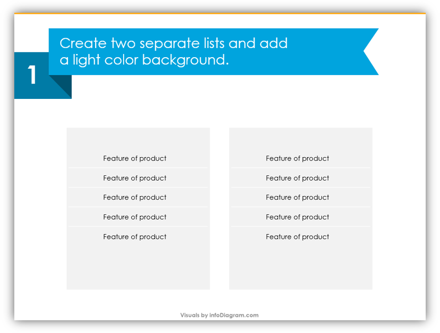
The easiest background shape is generally a rectangle. The important thing is that these two (or more) lists should be visibly separate. You’ll want it to be clear that they are different things rather than one big list.
Add yes/no icons and the product names
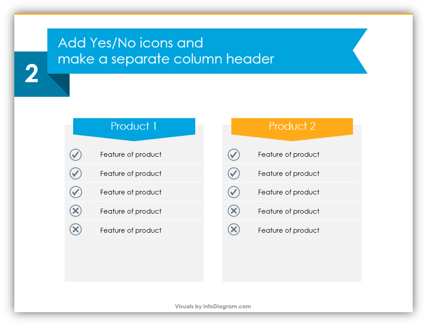
You’ll need to add yes/no icons to identify which attributes are shared and which are unique to each product. Checkmarks are common symbols for yes, while it’s common to indicate no with an x. When you add a colorful shape to the top of the list, you can clearly make a label for each product which will stand out.
Add decorative triangles at the top and icons at the bottom
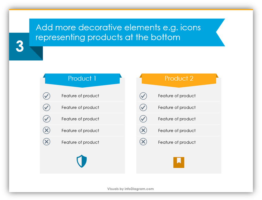
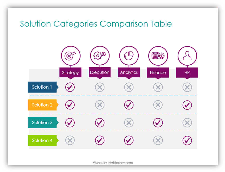
By adding triangles at the top to the colorful labels, you’re adding a powerful decoration element. The subtle details add a stylish 3D look. The icons at the bottom can be used to reference the type of product or categories being compared.
That’s it! If you have more than two categories you need to compare, you would simply replicate the steps across the additional columns. This can be done for as many columns as you need.
Please feel free to re-use the templates provided in the full graphics set rather than make your own. You may also make your own based on the tips provided here. You should feel free to add additional slides from [relevant icon pack] if you need more variety or ideas for the embellishing icons at the bottom of the lists.
Graphical Resources: Creative Comparison Tables Template
To help you present comparison effectively we created the Creative Comparison Tables Template. These diagrams are useful for comparing different offerings in service plans, different features across products, and more! If you need to share the similarities and differences, a Comparison Table will help you do so effectively. By customizing the icons you use from the set or build yourself, you’ll be able to wow your audience while ensuring they fully understand your message.