Corporate Data Visualization Training: Attractive Charts and Tables in PowerPoint
Interactive online workshop
Learn how to quickly create clear and attractive data visualizations:
- how to decide what data to show
- what’s the best chart type for your data
- work smoothly with MS PowerPoint & Excel charts
- how to present with data story-telling approach
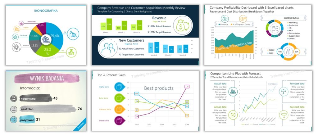
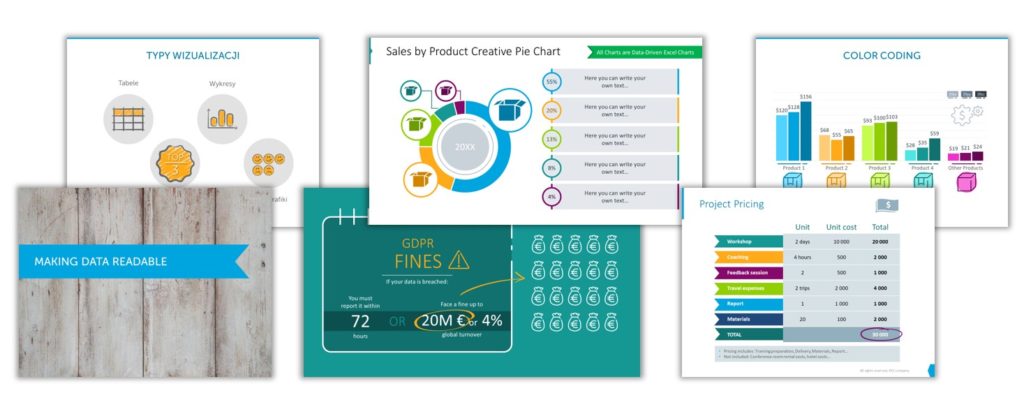
- design tricks for facelifting standard data tables and charts to make them more readable and attractive
Training Cost & Application
Invest 250 USD for 8 hours of live training.
- 2×4 hours of live online sessions with two trainers, professional data and slide designers (see below)
- training materials – exercises, PPT shortcuts list
- additional graphics – over 50 icons and data visualization templates for commercial use
- training handbook and eBook “Professional Slide Design Cheatsheet”
- if ordered 2 weeks before the event: $58 subscription to infoDiagram.com PPT graphics library, 1 hour of individual consulting after the training
Ask us for the detailed training program here.
Date: February 1-2, 2024
- Time adjusted to group. Preliminary 11am – 3pm EDT
= 4 – 8pm GMT (UK), 8am – 12pm PDT, 8pm – 12am (IST). Including breaks - Design theory and interactive exercises on your computer
- Work on your slides, if you want
- Learn from your home or office, online live session
- Small group – max 10 people for a training session
Book your place today:
Application Deadline: December 6, 2023
Secure your spot today. Order and pay online.
Money back guarantee, if the event won’t take place.
Not decided yet? Send us a preliminary application or question.
We will reply (within 2-3 days) about spots left and event details.
Topics of the training:
- data visualization mistakes people do with Excel charts and tables
- four ways to visualize numbers (tables, charts…)
- selecting what data values to present and how
- types of MS Office data charts and when to use them
- moving data from MS Excel to PowerPoint – tips and tricks
- redesigning data charts and tables using PowerPoint tools
- graphical enhancement of bar charts, pie charts a line plots
- do-it-yourself exercises & real-world business cases
Ask us for the detailed training program here.
Exercises are based on MS PowerPoint and Excel charts, but most of the knowledge is general.
Companies we’ve already trained Red Bull, Credit Agricole bank, Hill and Knowlton PR agency, Mercer, Sitech (Volkswagen group).
When?
- February 1-2, 2024, open course. Contact us for other dates
- Duration: 2 * 4 hours
- Time adjusted to group (preliminary 17-21:00 CET = 11-15:00 EDT) including breaks
- Online live session
- Limit of max 10 people for the training session.
Not a suitable date for you?
Stay informed about the next training events. Leave us your email and get Free Guide & Graphics “5 Slide Visualization Ideas”:
Trainers


Peter Zvirinsky
Presentations Design & Data Visualization expert. Diagram magician.
Peter started a career in IT consulting, where he was a marketing director in a data science company. He served also as a president of an international non-profit organization and soft-skills trainer. Later he discovered a new passion for business slides design and now specializes in helping organizations in crafting visual presentations.
- prepared and delivered tens of business presentations at conferences, scientific forums, and sales events.
- over 10 years of experience in delivering training on presentation skills and interpersonal communication. He’s a certified trainer of BEST organization since 1999, delivered 30+ training sessions and events, all over Europe (England, France, Poland, Belgium, Germany, Slovakia, Romania…).
- Former director of marketing in an IT consultancy company, delivering sales presentations, technical training, and preparing business plans and sales offers.
- Former president of BEST Europe – a European-wide non-profit organization
See more at Peter’s LinkedIn profile.
Izabela Zvirinska
Graphic Designer. Visual Identity Expert. Font’oholic.
Izabela is computer graphics professional and a passionate font’oholic.
She started as a designer of logos, brochures, and visual identity projects for various companies. In Prezentio she discovered a new passion for presentation slide design.
Izabela loves hand-drawn style and the artistic look of watercolor shapes. If you’ll let her, she will surprise you with a unique watercolor presentation template, that will for sure make you stand out at any conference or meeting.
- Over 13 years of computer graphics design, over 130 logo visual identification projects delivered.
- Art Director in TulipDesign agency
- Chief Design Officer in infoDiagram – online library of presentation graphics
- Experienced trainer of graphic design and soft-skills, held training events all over Europe (Poland, Belgium, Germany, Croatia, Slovakia…). Certified trainer of BEST organization since 2001.