Visual Data: Data Visualisation in PowerPoint (Excel charts & tables)
Interactive online data visualisation course - charts, tables, KPI and dashboards in PowerPoint
Learn how to quickly create clear and attractive data visualizations:
- how to decide what data to show
- what’s the best chart type for your data
- work smoothly with MS PowerPoint & Excel charts
- how to present numbers with data story-telling approach
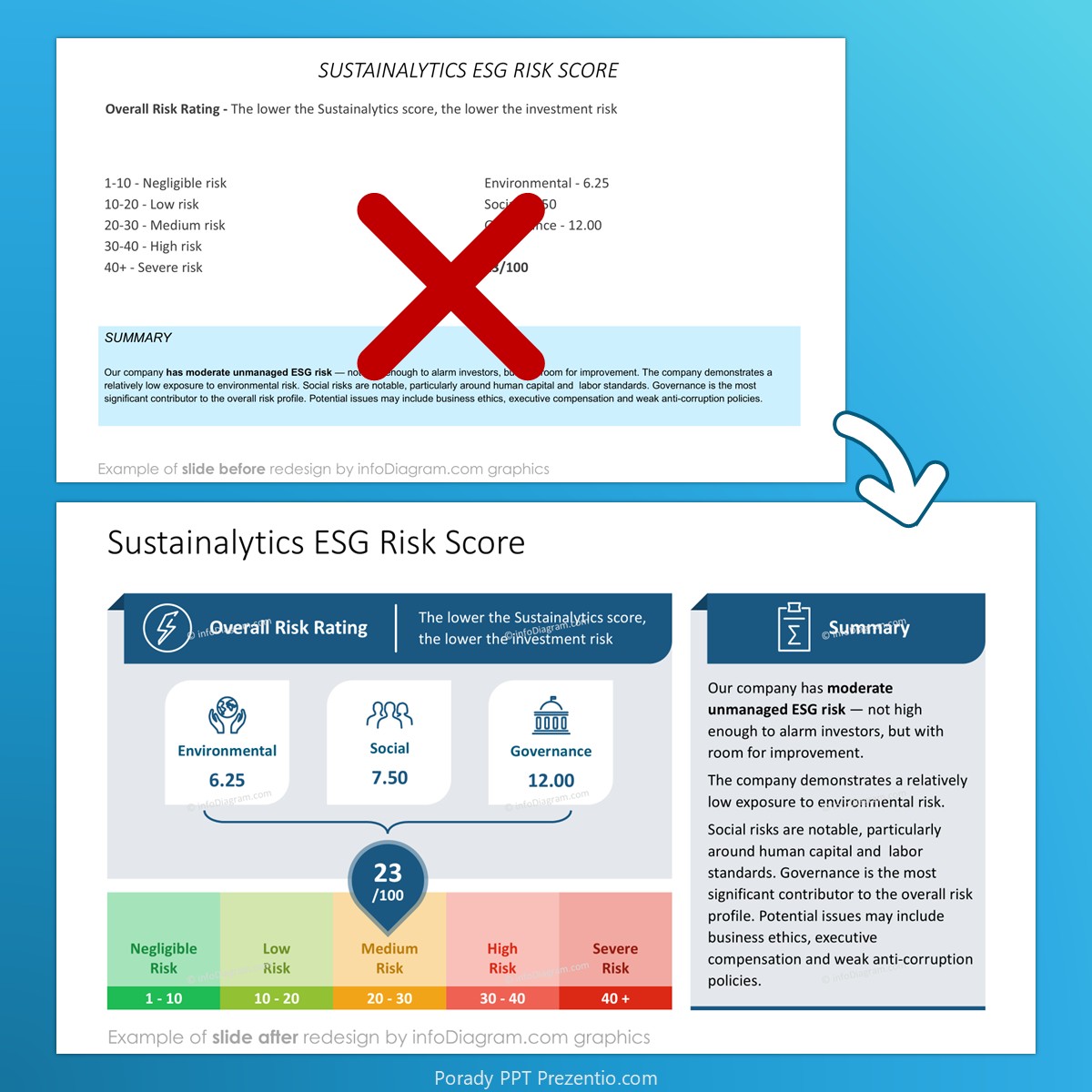
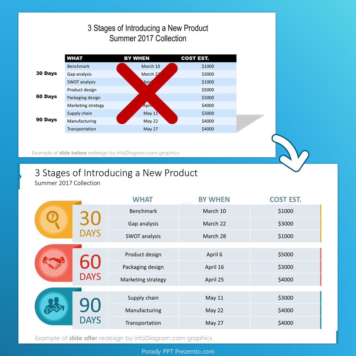
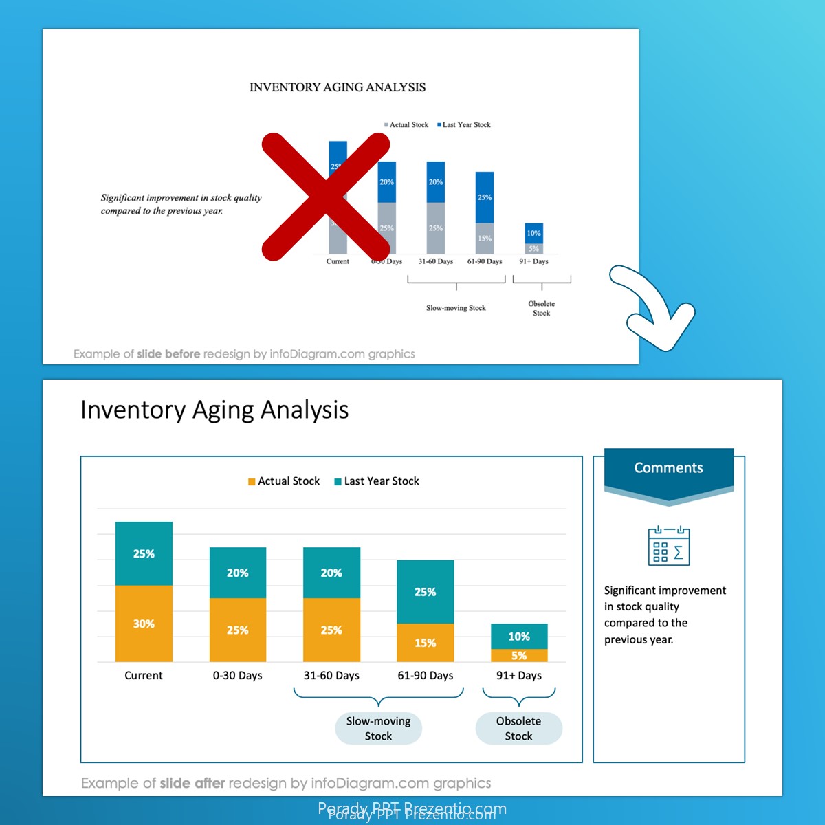
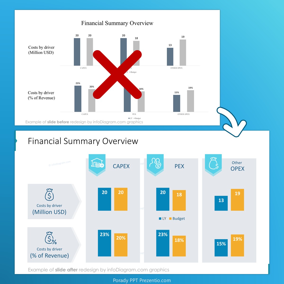
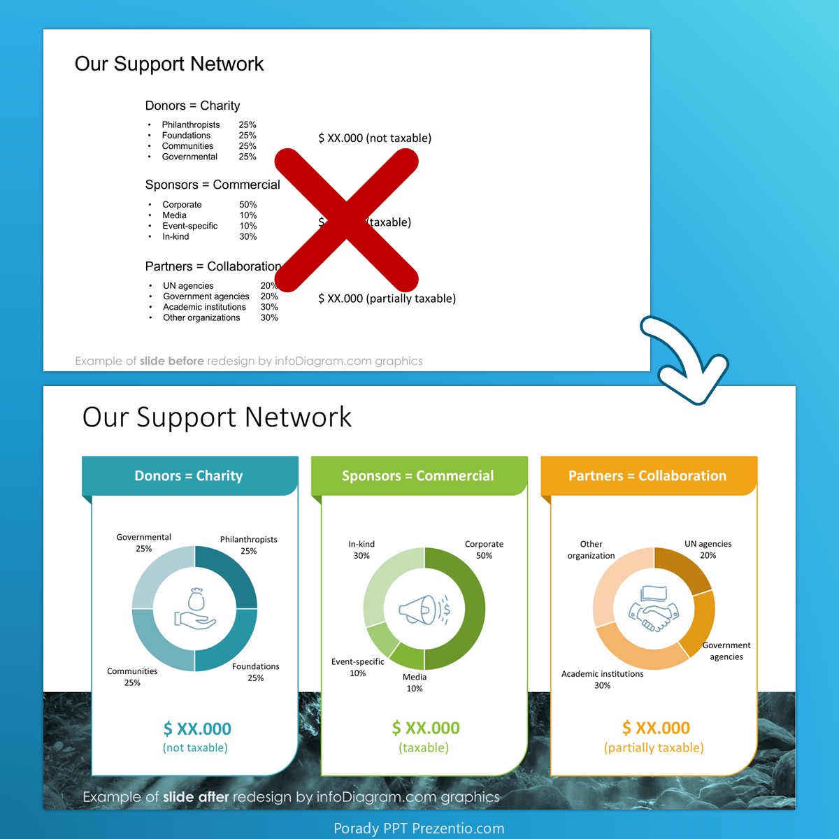
- design tricks for facelifting standard data tables and charts to make them more readable and attractive
Training Cost & Application
Invest 250 USD for 8 hours of live training.
- 2×4 hours of live online sessions with two trainers, professional data and slide designers (see below)
- training materials – exercises, PPT shortcuts list
- additional graphics – over 50 icons and data visualization templates for commercial use
- training handbook and eBook “Professional Slide Design Cheatsheet”
- if ordered 2 weeks before the event: $58 subscription to infoDiagram.com PPT graphics library, 1 hour of individual consulting after the training
Ask us for the detailed training program here.
Date: September 10 – 11, 2026
This date does not fit you? Next session October 29-30. Or contact us for an individual session.
- What hours (let us know if you prefer a different one):
- 11 am – 3 pm EDT
4 pm – 8 pm GMT UK
5 pm – 9 pm CET
8 am – 12 pm PDT
8 pm – 12 am IST
- 11 am – 3 pm EDT
- Design theory and interactive exercises on your computer
- Work on your slides, if you want
- Learn from your home or office, online live session
- Small group – max 10 people for a training session
Book your place today:
Application Deadline: August 24, 2026
Invest 250 USD for 8 hours of live training, with bonuses worth 100 USD:
Secure your spot today. Order and pay online.
Money back guarantee, if the event won’t take place.
Not decided yet? Send us a preliminary application or question.
We will reply (within 2-3 days) about spots left and event details.
From Excel data to clear charts: what this training covers
- data visualization mistakes people do with Excel charts and tables
- four ways to visualize numbers (tables, charts…)
- selecting what data values to present and how
- types of MS Office data charts and when to use them
- moving data from MS Excel to PowerPoint – tips and tricks
- redesigning data charts and tables using PowerPoint tools
- graphical enhancement of bar charts, pie charts a line plots
Ask us for the detailed training program here.
Designing readable tables, KPIs and dashboards - with practical exercises:
- Training includes several do-it-yourself exercises & real-world business cases
- Exercises are based on MS PowerPoint and Excel charts, but most of the knowledge is general.
Who is this data visualisation course for?
- Data-heavy roles (controlling, finance, data science, reporting, quality, project planning), who must turn Excel data into clear charts and tables.
- People presenting numbers, KPIs and results to management or boards, where the audience must grasp the key conclusion in seconds.
- Anyone handling complex data (budgets, timelines, forecasts, process and financial flows) who needs readable presentation, not cluttered slides.
- Professionals wanting practical techniques for charts, tables, dashboards and embedding Excel data (including keeping file size down).
- Corporate specialists preparing executive or board-level data presentations.
Companies we’ve already trained Credit Agricole, Red Bull, Deutsche bank, Hill and Knowlton PR agency, Mercer, Porsche Financial Services, Toyota Motors.
When?
- Sept 10-11, 2026, open course. Next session October 29-30. Contact us for other dates
- Duration: 2 * 4 hours
- Time: preliminary 11-15:00 EDT = 17-21:00 CET
- Online live session
- Limit of max 10 people for the training session.
Not a suitable date for you?
Stay informed about the next training events. Leave us your email and get Free Guide & Graphics “5 Slide Visualization Ideas”:
Check other training topics
Stay updated, Sign up
Trainers


Peter Zvirinsky
Presentations Design & Data Visualization expert. Diagram magician.
Peter started a career in IT consulting, where he was a marketing director in a data science company. He served also as a president of an international non-profit organization and soft-skills trainer. Later he discovered a new passion for business slides design and now specializes in helping organizations in crafting visual presentations.
- prepared and delivered tens of business presentations at conferences, scientific forums, and sales events.
- over 10 years of experience in delivering training on presentation skills and interpersonal communication. He’s a certified trainer of BEST organization since 1999, delivered 30+ training sessions and events, all over Europe (England, France, Poland, Belgium, Germany, Slovakia, Romania…).
- Former director of marketing in an IT consultancy company, delivering sales presentations, technical training, and preparing business plans and sales offers.
- Former president of BEST Europe – a European-wide non-profit organization
See more at Peter’s LinkedIn profile.
Izabela Zvirinska
Graphic Designer. Visual Identity Expert. Font’oholic.
Izabela is computer graphics professional and a passionate font’oholic.
She started as a designer of logos, brochures, and visual identity projects for various companies. In Prezentio she discovered a new passion for presentation slide design.
Izabela loves hand-drawn style and the artistic look of watercolor shapes. If you’ll let her, she will surprise you with a unique watercolor presentation template, that will for sure make you stand out at any conference or meeting.
- Over 13 years of computer graphics design, over 130 logo visual identification projects delivered.
- Art Director in TulipDesign agency
- Chief Design Officer in infoDiagram – online library of presentation graphics
- Experienced trainer of graphic design and soft-skills, held training events all over Europe (Poland, Belgium, Germany, Croatia, Slovakia…). Certified trainer of BEST organization since 2001.