How to create attractive, visual slides for webinars and remote training

Do you run online training or webinars? Let me suggest what you can do to make your slides attractive and easy to remember.
Having a quickly to grasp content is the key to good virtual presentation. Nobody likes the wall of text, even a slide with 5 text bullet points, it can be too much, especially if you are having online audience. If you do not add the right context illustration, you risk that you will loose quickly focus of your listeners.
As a presenter of your webinar, you probably know the content very well. You don’t need slides with a lot of text to support your talk. It’s enough if you write only keywords, use large numbers and frame them with an interesting graphic design that build visual association.
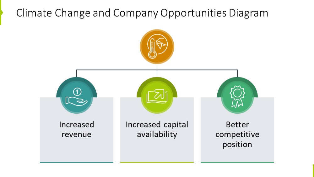
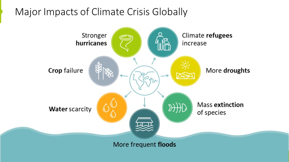
An example is the slide below, where we’ve extracted from source text only three key areas and illustrated them with icons and a simple diagram. The rest of story was presented verbally or in additional material:
What to do to make participants remember what’s most important?
First of all, think about the content of the slide. What’s most important out of all information you have there? Choose this one key point and display it so that it catches your attention first.
You can put thay key content on the banner, in the frame, or a handwritten speech bubble, to make it stand out. See how you can do, for example, a quote slide when you do a webinar on motivational speech:

Are you showing a number? Make it really big, place it in the shape of e.g. a circle and add a link to the text so that you know what this number means.
For more presentation graphics know-how and PowerPoint tricks, check our Online Training Workshop on Effective Visual Slides.
To help you out with using graphics tools in converting a slide from text to more interesting graphics, I present a few ideas how to visually enhance the slide:
1. Add an illustration supporting your key points
To make the essence of your slide remembered, add a visual symbol connected to the point you present. For instance, if you’re talking about strategy, add a chess icon, business excellence idea can be represented with stars or diamond icon.
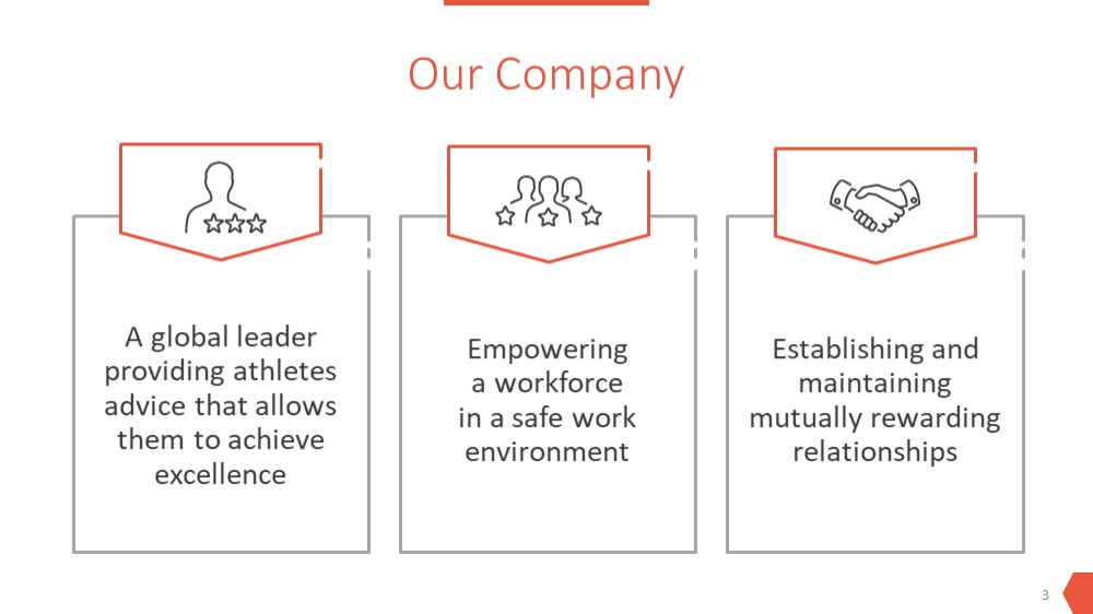
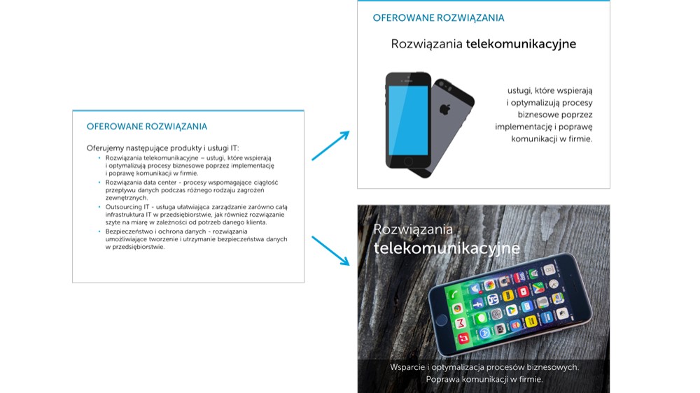
See how we visualized the slide with the company description, adding the appropriate icon to each of the features.
To make specific slide stand out, consider adding a photograph on the entire slide and write the keyword on it. Well chosen photos attract attention, evoke associations and can also add emotion element to the presentation.
2. Present the slide content with diagrams
To replace text content by simple infographic, I encourge you to start using diagrams of various kind. Depending on what type of information you have, use Venn diagrams, Flow charts or Hierarchy maps.
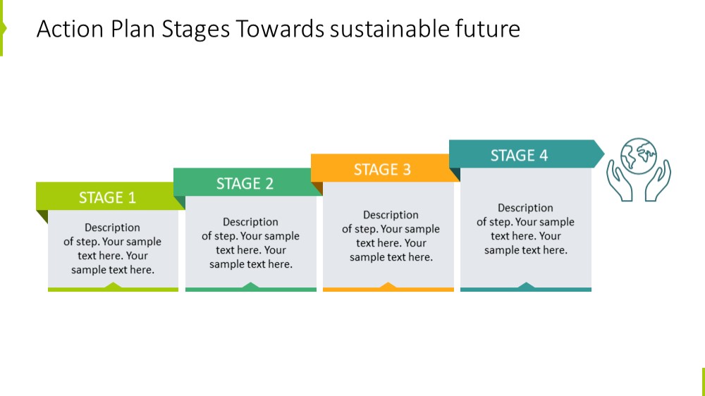
For example, if you have a list of steps in time, use a series of arrows and place texts below it, or create this kind of stair graphics – we created this slide using .
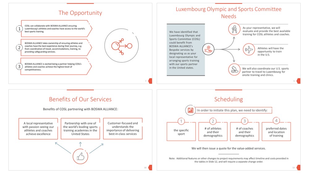
Another example presents list of product features or benefits. We replaced the bullet points with a list of shapes.
3. Overcrowded slides? Split them
The cure for too dense overcrowded slides is to divide them into several slides – one for each key point.
In this way, you will gain more space on the slide, and thus focus the listener on the main thought. It is better to present information gradually so that they are easier to remember. If you want to keep the relation between slides, you can add a summary slide of your points at the end.
Below are two suggestions on how you can change the text slide to a more visual form. In the second version, the photo is inserted on the entire slide to break the presentation flow and attract more attention to this particular slide.
Final check – follow golden rules of design
Before going online, have a final look at your presentation slides. To ensure your slides look professional and legible, do a quick visual check following basic design rules:
- Consistency – unify fonts, colors, shapes so that everything looks consistent, not like copy-pasted from different presentations. Notice below the use of one outline style for shapes and only 2 basic colors – orange and grey:
- White space – having enough unused space on the slide will ensure a professional and elegant look. Avoid stuffing too much content edge to edge. Use the same margins on each slide.

- Alignment and distribution is a important tool in the fight against chaotic look of the slide?. Using PowerPoint smart guides will help you to keep objects neatly located.
Following those rules along with having visual content, will help you create a smooth presentation flow. This will avoid quick distraction of your audience – and that’s the biggest challenge in case of virtual meetings.
For more presentation graphics know-how and PowerPoint tricks, check our Online Training Workshop on Effective Visual Slides.
Good luck with conducting your training and webinars ?. Should you need an advice or assistance, contact me here, I will be glad to help.
Peter Zvirinsky,
Slide Designer, Trainer and Founder of Prezentio.