


Learning Slide Design in the AI Era: Still Worth It?
Is it still worth learning how to design professional slides when AI can generate a whole deck in seconds? Yes. Here’s why, with real before-and-after examples.
My LinkedIn feed is full of posts about the newest AI tool that builds a presentation in seconds. And yet, more and more decks I see look… the same. Correct, but bland. The same pattern again and again: a picture on one side, a block of text on the other. No idea behind it.
You can probably spot an AI-written LinkedIn post by now. Something feels missing. Slides made with AI tools often have the same problem – that generic “AI look”. How well AI performs depends on the task:
- Text – good. Rewriting a slide title, naming a deck, polishing a feature description.
- General themed images – OK.
- Graphics that must show logic – weakest. Complex schemes, diagrams with relationships. This is where you’ll most often get pretty shapes with the wrong logic behind them.
That’s exactly why visualisation basics still matter. Maybe even more than before AI.
I studied artificial intelligence and played with machine-learning algorithms long before ChatGPT made it a dinner-table topic. Today, together with my co-trainer Izabela, we work on business presentations every day – and we test AI tools wherever a project allows. We check where they help and where human judgement and experience are still key. Here’s what that taught us – three reasons to know the basics of design and information visualisation:
- Stay authentic – your presentation should speak in your voice, not a template’s
- Stay in control of quality – you know best when AI hit the point and when something needs fixing
- Get more out of AI tools – a bit of background in visual communication and design principles helps you write better prompts and judge the results
What has AI really changed in business presentations?
Some tools now create an icon for you – even a decent one. Others write the slide text or suggest the whole structure of your deck.
We still prefer to draw our icons ourselves. They feel like ours, and honestly, we enjoy it 😊. But I get that not everyone has the time or the need.
The real problem is elsewhere: AI doesn’t know what you actually want to show. It can produce something that looks right but misses the point. Hallucinations, wrong numbers, broken information hierarchy – we run into these regularly when reviewing AI-generated decks.
As a data visualisation person, the one that worries me most is a clean-looking chart with the wrong figures. Nobody questions a chart that looks professional.
Remember: whatever tool you use, you’re the author of the presentation and you’re responsible for its content. AI is an assistant, not the subject-matter expert. The key is understanding what you want to show. If a tool drafts your deck, you still need to check it and fix the substance. When AI can’t guess what you need, it fills the gap with generic filler. Well-built prompts help a lot – but that’s a topic for another post.
Good slide visualisation starts with understanding your content
Before you start designing, stop and ask yourself one question: what type of information am I showing?
Don’t jump straight into PowerPoint Designer, Copilot or another AI app. Hold off on ready-made presentation templates too.
We like to start with a sheet of paper. Sketching the deck by hand helps you see the whole picture before you get lost in details. Do you do the same?
We always choose graphics and diagrams based on the content. We analyse the topic, pull out the key relationships, and only then match them to the right type of visual.
3 types of content that need different visuals
Below are three examples. At first glance they all look the same – a list. But each one needs a completely different design approach. Here’s a quick cheat sheet:
| Content type | Typical examples | Diagram that fits |
|---|---|---|
| Equal items, no relationships | Benefits, product features, company values | Icon grid, cards, central circular layout |
| Ordered items – sequence matters | Implementation phases, customer journey, procedure | Horizontal process flow, timeline, roadmap |
| Hidden structure – hierarchy or groups | Departments in a team, budget categories | Pyramid, pillars, layers, tree, Venn diagram |
1. A simple list – no relationships between items
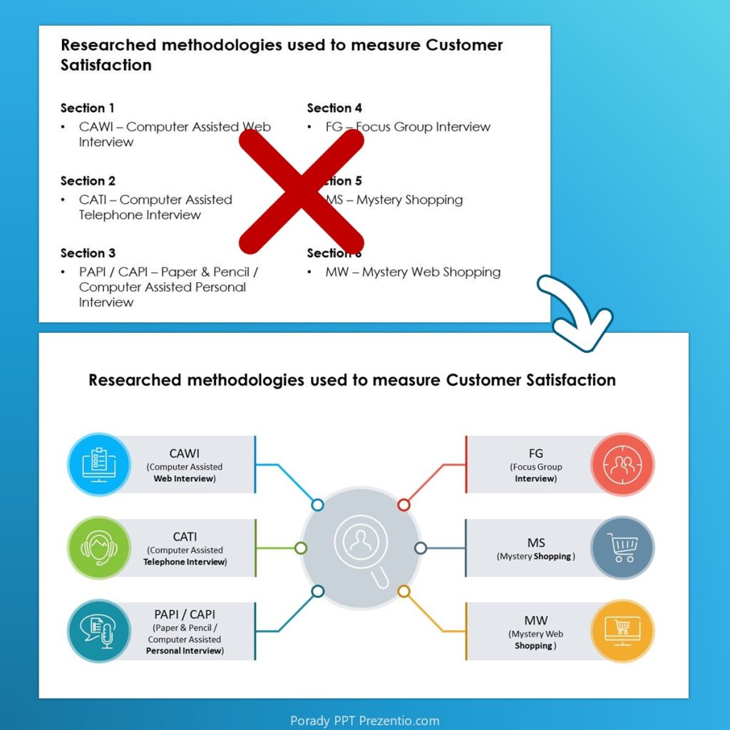
Showing a set of equal items – like benefits, product features or company values? You don’t need a diagram with connectors. A clean layout of cards or icons with a short description does the job.
Try a grid, or another even layout with icons and a short text under each. Notice how equal spacing and same-size icons create order and balance. No item dominates the rest – which visually tells your audience: these are equal.
Here are a few slide makeovers with this kind of list:

With a central layout:
2. An ordered list – a process or steps
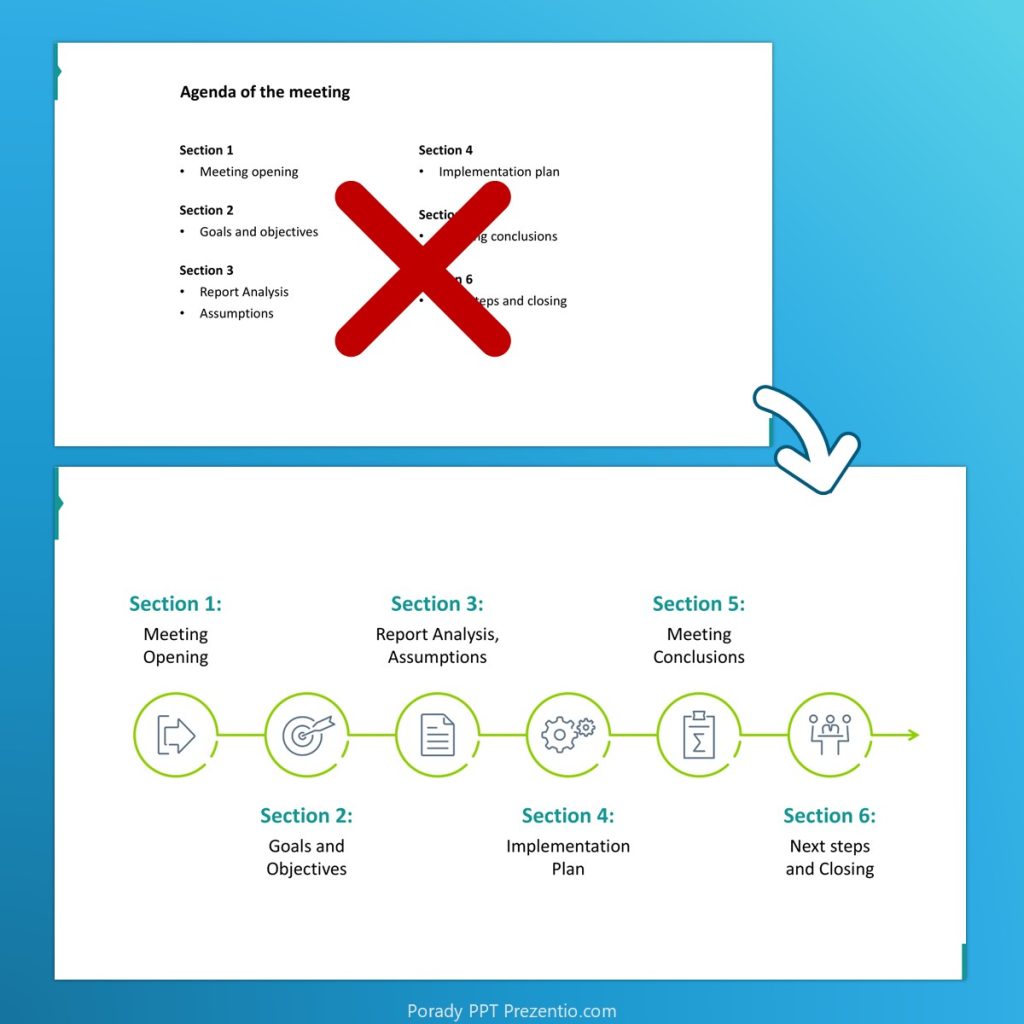
When the order matters – implementation phases, a customer journey, a procedure – a linear or arrow diagram makes the sequence obvious. Your audience sees right away that step two can’t come before step one.
Try a horizontal flow with numbered or illustrated stages, connected by arrows.

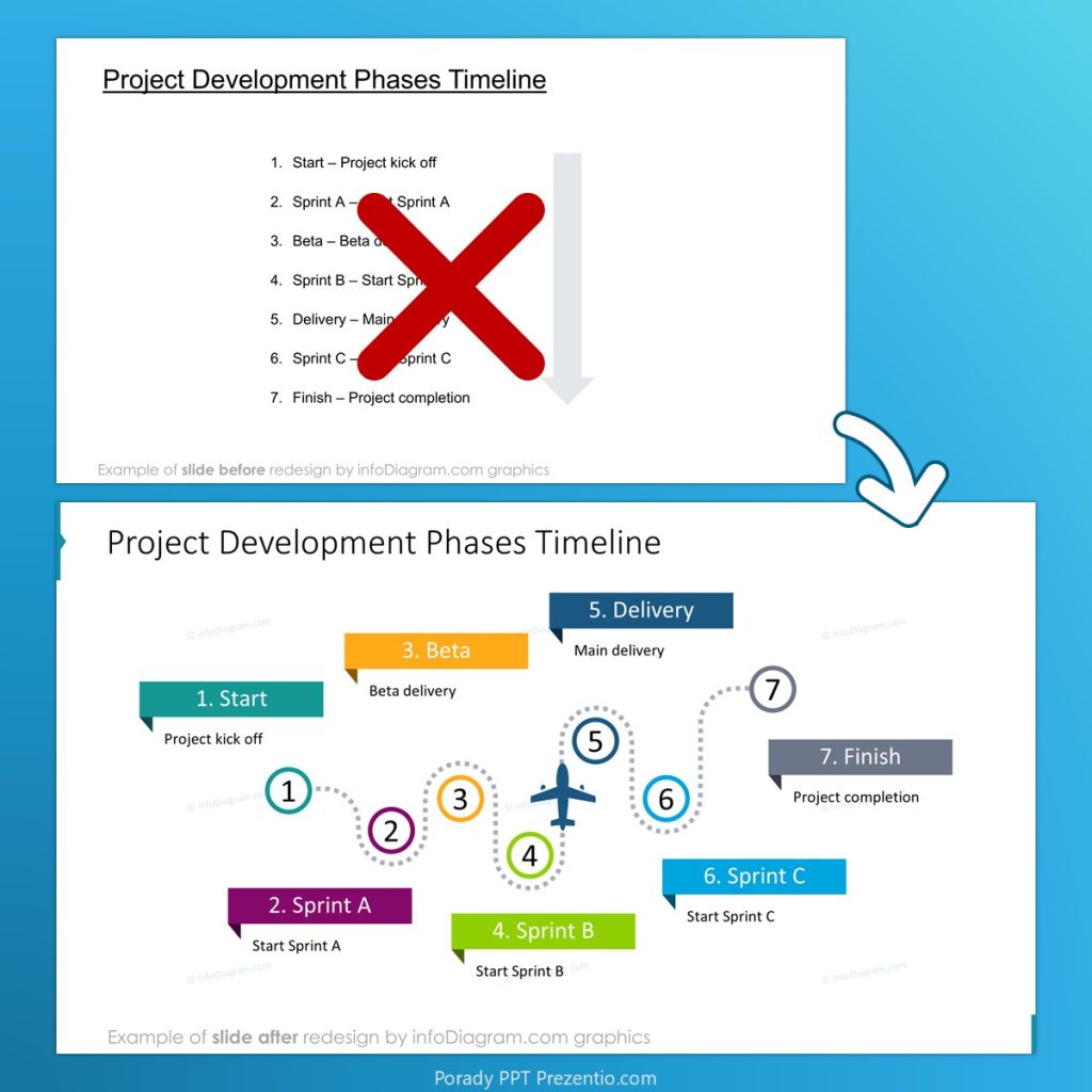
Got more steps? Use a roadmap illustration – a winding road with milestones.
3. A list that hides structure – hierarchy or groups
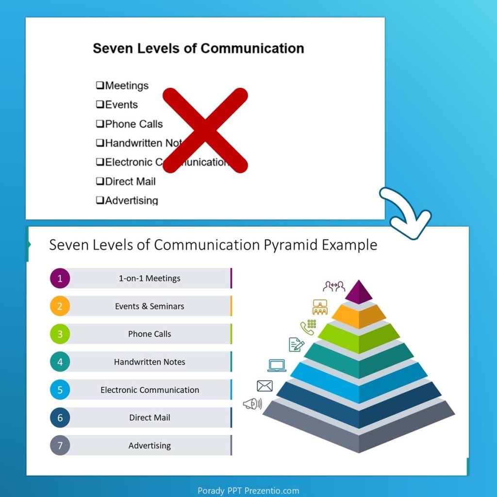
Sometimes a list looks flat but actually hides subgroups or a hierarchy. Think of a team made up of departments, or a budget split into categories and subcategories.
Here, consider a pyramid, pillars, a Venn diagram or a tree diagram. You can also show groups with colour coding or nested blocks. See a few of our slides of this type:
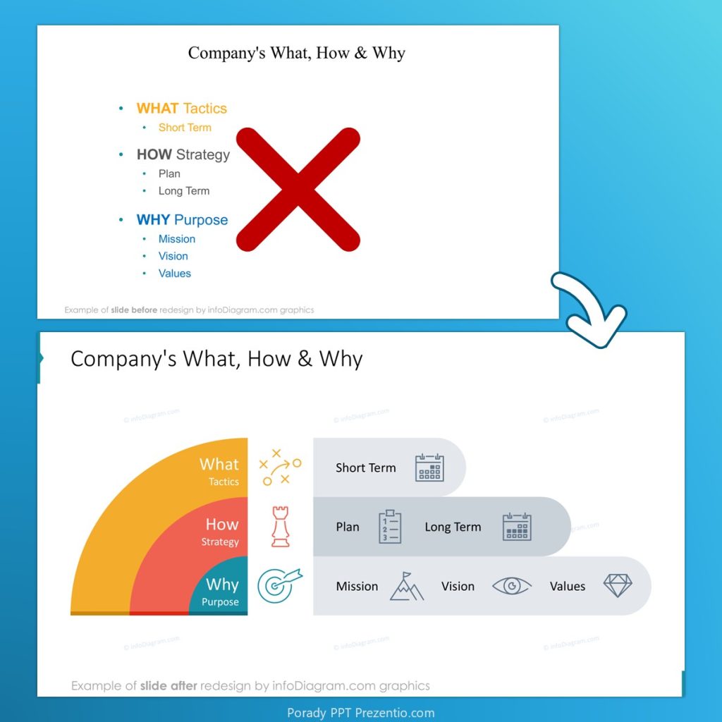
How do you know AI suggested the right diagram?
Tools like PowerPoint Designer (“Design Ideas”) or Copilot in PowerPoint can suggest a diagram automatically. And sometimes they nail it.
But if you don’t know the difference between a process flowchart, a matrix and a tree diagram, you won’t notice when AI gets it wrong. And it gets it wrong regularly – especially when the source text is ambiguous.
Knowing the basic types of visuals lets you judge the AI’s suggestion and, if needed, steer the tool in another direction with a more precise prompt.
Want to pick and polish diagrams like these faster in PowerPoint? We show it step by step in our Visual Slide Design – Advanced PowerPoint training. For a hands-on overview of what AI can do for presentations today, join our AI & PowerPoint training with Microsoft Copilot.
FAQ – slide design and AI
Can AI design a good presentation on its own?
It can produce a solid first draft, especially the text. But it doesn’t know your audience, your message or which numbers really matter. A human still needs to check the logic, the data and the visual hierarchy.
What do AI presentation tools get wrong most often?
Diagrams that must show relationships – processes, hierarchies, groups – and charts with real data. The result often looks polished but doesn’t match the content, or repeats the same generic layout on every slide.
Do I need to become a designer to fix AI-generated slides?
No. You need the basics: recognise what type of content you have, know which diagram fits it, and spot when a layout feels off. That’s usually enough to turn an AI draft into a slide that works.
Summary – tools change, understanding stays
Whatever new plugins, PowerPoint add-ins or AI apps show up in the coming months, you’ll always be the owner of your presentation. And your audience will be people, not algorithms.
AI can speed up your work. It can’t replace thinking about what you want to say, and to whom. Even a basic sense of what makes a good visual puts you ahead of someone who clicks “generate” and accepts the first result.
Clear content type + Right diagram + Your own judgement = A slide that works – and doesn’t look AI-generated.
Maybe that’s the whole point: you don’t need to become a graphic designer. You just need to know enough to judge whether what you see on the slide actually works.
Peter
Presentation Designer & Data Visualisation Trainer, Co-Founder of Prezentio
For more examples, follow me on LinkedIn, or join our newsletter with PowerPoint tips. I share slide design advice and before-and-after makeovers of real business slides there.