How to Make Coronavirus Info Materials in PowerPoint
You may be watching this disease development day to day, as I do. I am trying to extract facts and evaluate dangers considering my family and business. I see over various media that proper explaining the facts is so important especially now. It helps people react appropriately, it helps not to overlook what’s the important.
Therefore I’d like to share a few tips on preparing clear information materials about Covid-19 disease, be it leaflet, banner or presentation of company actions. All made using only PowerPoint. See examples below.
BTW, you can get all presented Coronavirus graphics for your personal use. To support fight against this disease, we share them free for any public healthcare, educational or government institutions. Generally for any good non-commercial use. Contact me to get access to the source PowerPoint graphics .
Creating banner or poster for a shop
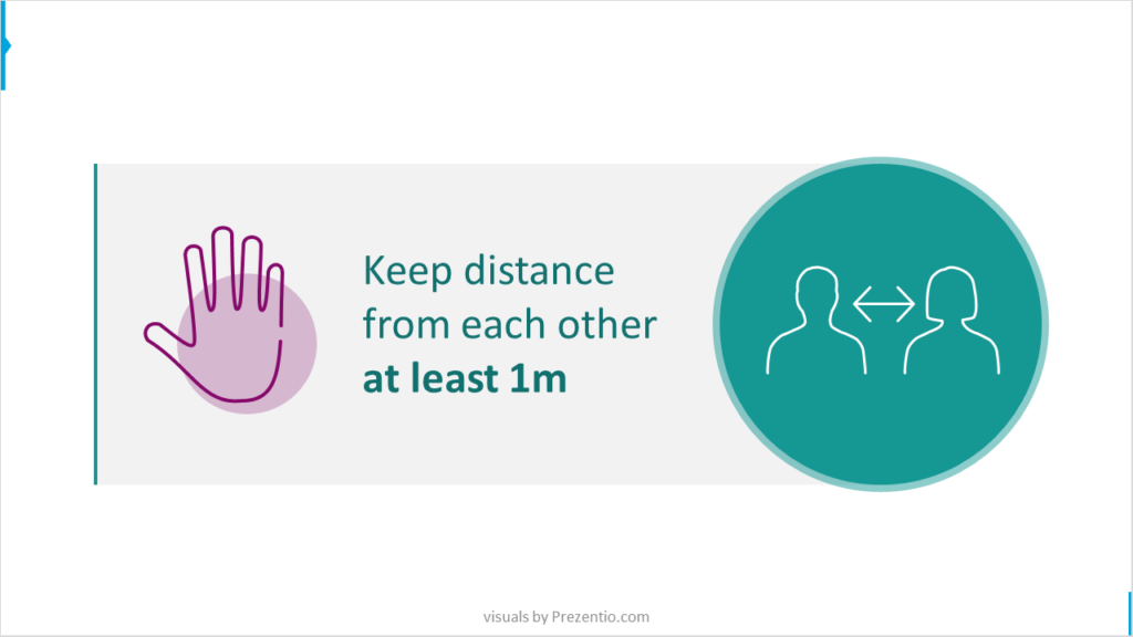
Do you want to create a simple information banner to put on shop or your company doors? I see many such signs on shops around. However they are often lost among other posters stick around.
For message to be noticed you need to create something called “whitespace” around. That is space with no information, to decrease information noise. Make sure people will notice the message – simply add one big visual symbol next to text. Like over here:
In similar manner you can create banner to share “stay-at-home” campaign in social media:
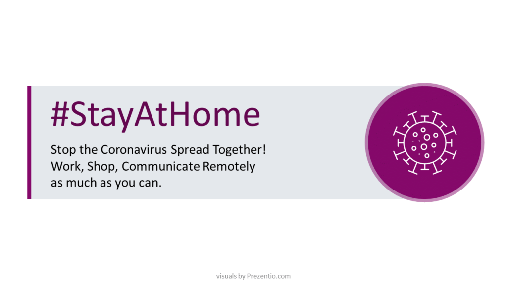
Of course you can add a background picture of you want. To save banner as picture for Facebook or other social media, use Save As icon and choose PNG format.
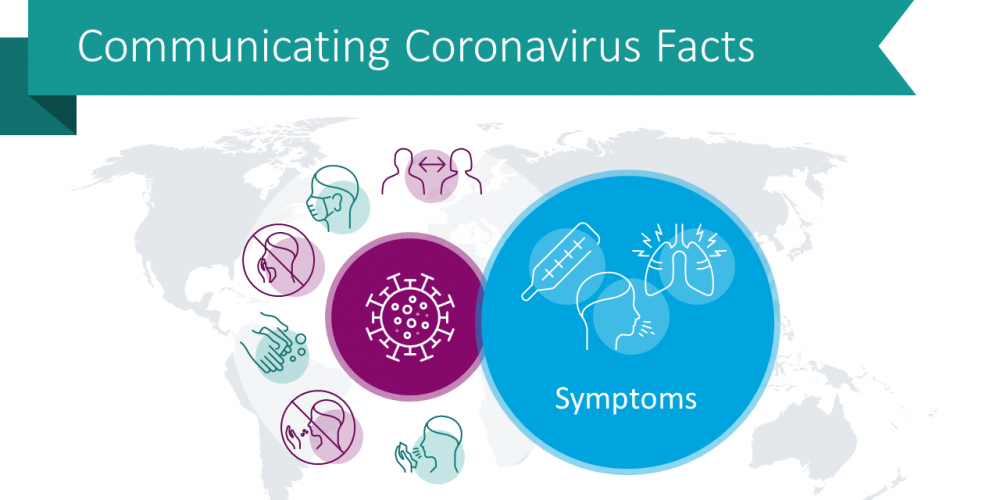
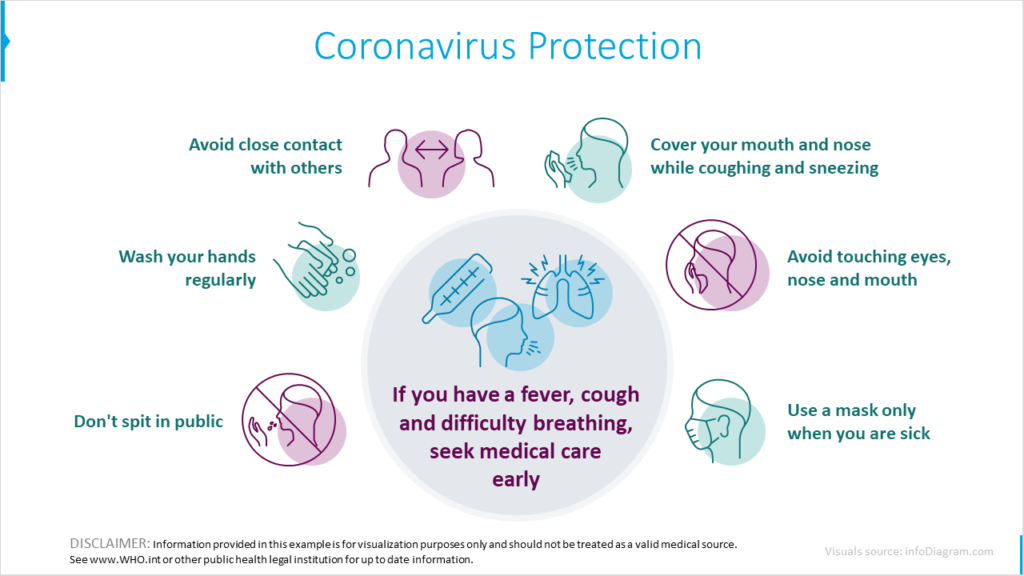
Visualizing Protection Guidelines
There are several common-sense hygiene rules that doctors recommend to protecting ourselves from getting coronvirus. To make these rules visible and easier to remember, avoid presenting them as a plain text. It’s better to present each rule as a separate text objects. In Microsoft Office apps (in PowerPoint, Word or Excel) there is a SmartArt tool, that can help you creating diagram out of text bulletpoints.
Then add some design elements, such as adding some pictures or symbols. This way you can create information material that is more attractive to look at.
Presenting statistics of Covid-19 severity
If you are going to present statistical data related to this disease, here is the way you can make it easier to understand.
Let’s illustrate one of the good news about Covid-19, information that most of the cases (over 80%) are mild and people can recover at home. You can represent this information by such illustration:
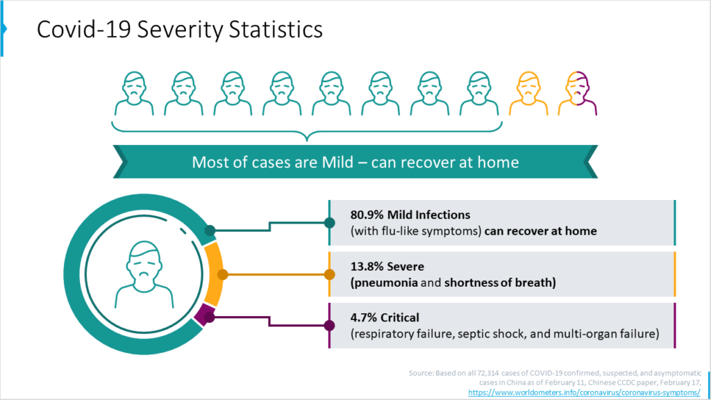
Notice that the same information can be represented by a pie chart or by serie of icons. Choose the one that fits more your audience. Pie chart if they are used to read such data, it is also more exact. On other side, iconographic is more simple to read.
Showing global spread of coronavirus over the continents
If you want to show geographical context of coronavirus pandemia spread, present in over a map of continents. Comparison of regions will be more readable and if you present the same data next to each other in separate boxes, each with different color coding.
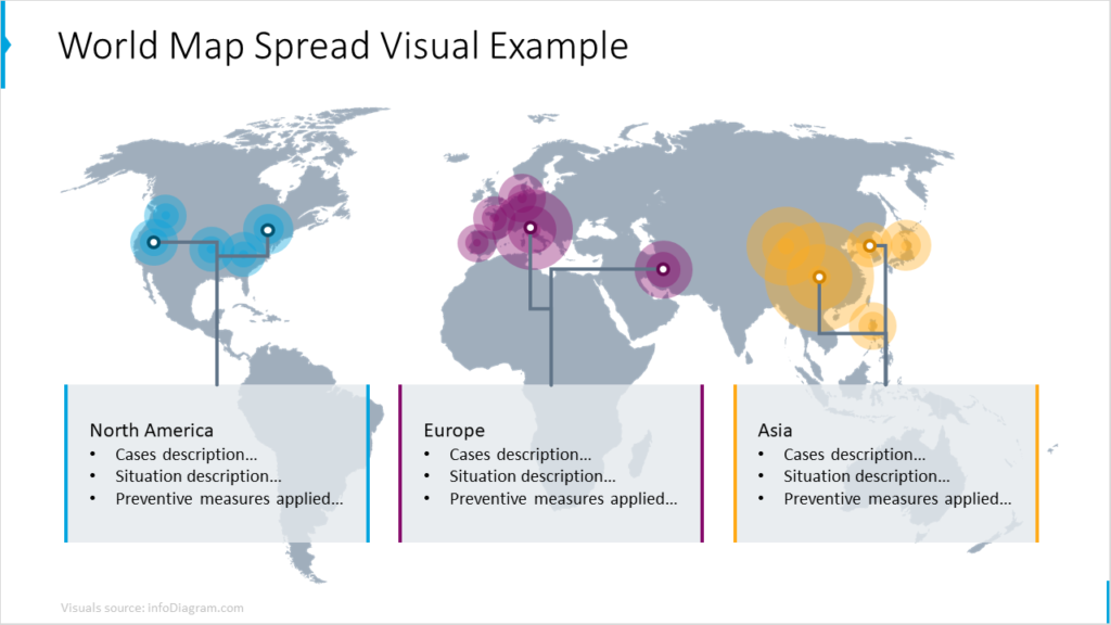
Speaking of proper data visualization, important fact to realize is specific country context. I mean population density, climate and typical behavior of people, as well as general level of healthcare. A hundred infection cases in 5 million Norway is different than in India. And healthcare access in United States or UK versus Syria will differ a lot.
Consider also if it’s better to visualize country statistics as a dots on a map or color of the whole country surface.
Use trustworthy data sources
When you present data, you want to be sure your data are correct. Check credibility of data source. Avoid trap of using low credit or unknown sources, just because they looks logical or support your view point.
In case of Coronavirus, rely on information from official institutions such as World Health Organization, CDC or European Centre for Disease Prevention and Control. They are better source than a local sensational media, especially the ones with populist background.
Here are data sources I am using for coronavirus:
- For health guidelines: World Health Organization, European ECDC or American CDC.
- For latest statistics on infectioncases: Worldometer, John Hopkins university website.
Stay safe and healthy during this challenging time.