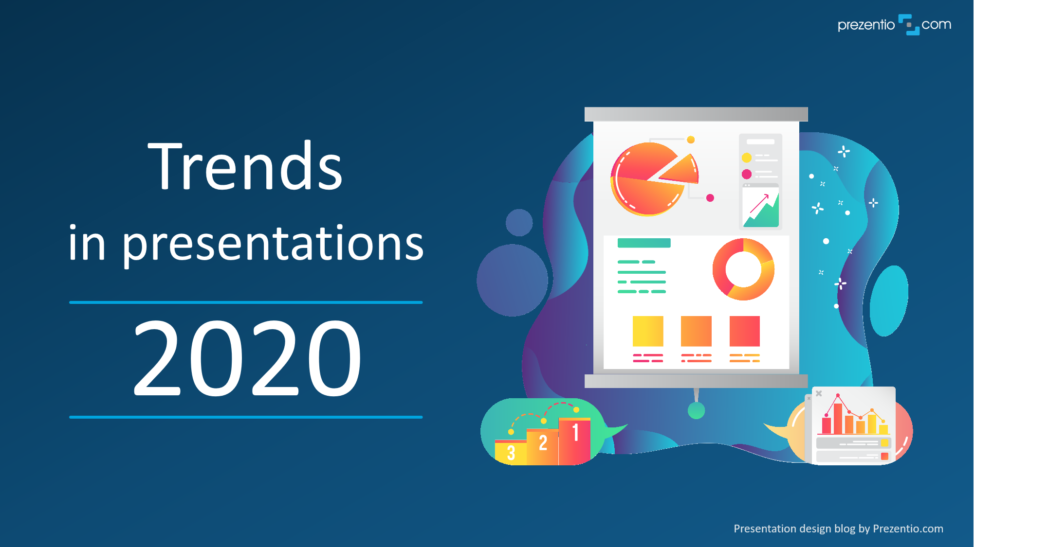
6 important trends in presentation design for 2020
What are common presentation trends, for the year 2020? What graphic styles should you use in your PowerPoint slides, so as not to look outdated?
On the one hand, presentations follow general graphic trends used in marketing, ads, websites. However, on the other hand, slides create a specific niche, as they are created by business people directly, often not the professional designers. Therefore not everything that is fashionable is good to use on slides. The reason is simple: presentations are mainly about readability and clarity of the message. This year, minimalism remains to be an important trend in context of PowerPoint.
If you are interested to learn more about presentation graphics and creating professional PowerPoint slides, check our online training on effective visual slides.
When I am going through the presentation design projects we have done this and previous years, I can see several directions how business requirements and preferences evolve.
Below I present six trends that you should consider if you want your presentation to look fresh and modern this year, too.
1. Flat style with a gradient
Ever-present plain flat graphical style has a new mutation. We observe that delicate shadow and gradient effects start to emerge slowly in presentations. The graphics will still be simple and without additional light reflections. However the shapes filling may be multi-colored, light gradient backgrounds will also appear more often.
Does this mean that the flat style starts getting outdated? I do not think so. I think the flat style will still be relevant this year ?
2. Isometric 3D shapes
Simple 3D graphics and isometric icons will be used frequently. People creating presentations may want to diversify their slides more and show visualizations in a slightly different form.
However, the challenge will be to maintain simplicity along the greater complexity of 3D graphics. The following example shows that this is possible.
(source infoDiagram)
For more examples of similar isometric visualizations, check this blog article Using 3D vector icons for making realistic PPT illustrations.
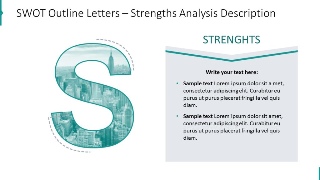
3. Pictures cropped to shapes
In context of using pictures the new creative way, there is trend of cropping pictures to non standard shape – various irregular blobs, or inside letter shapes, as you can see below. Using PowerPoint you can easily crop your photos to various shapes.
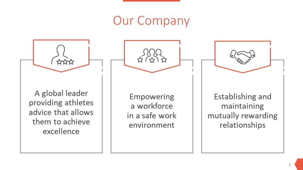
4. More of elegant outline style
Light style if outlined icons and contour shapes is getting more and more popular in business presentations. It looks elegant and minimalistic. Furthermore, printing such slides is more eco-friendly than printing flat graphics slide (better don’t do it).
Speaking of outline graphics, I mean outline icons, template graphical elements and also entire diagrams. See example on slides below:
5. Using the Morph effect in PowerPoint animations
When it comes to animations, I am in favor of moderation and using them in such a way to support the presenter, and does not overtake the attention from her.
However, if you want to get the WOW effect or create a presentation that is presented without a speaker, for example a demo on YouTube, then it’s worth looking at the recent PowerPoint’s Morph animation function. It is present in newer versions of MS PowerPoint (Office 2016 and Office 365). Morph creates an eye-catching effect of moving one element into another or smoothly changing the position of one element on the slide.
To see this effect in action, take a look at the following YouTube video made in PowerPoint. You can see it at 1:00 and 1:20 minute of the presentation.
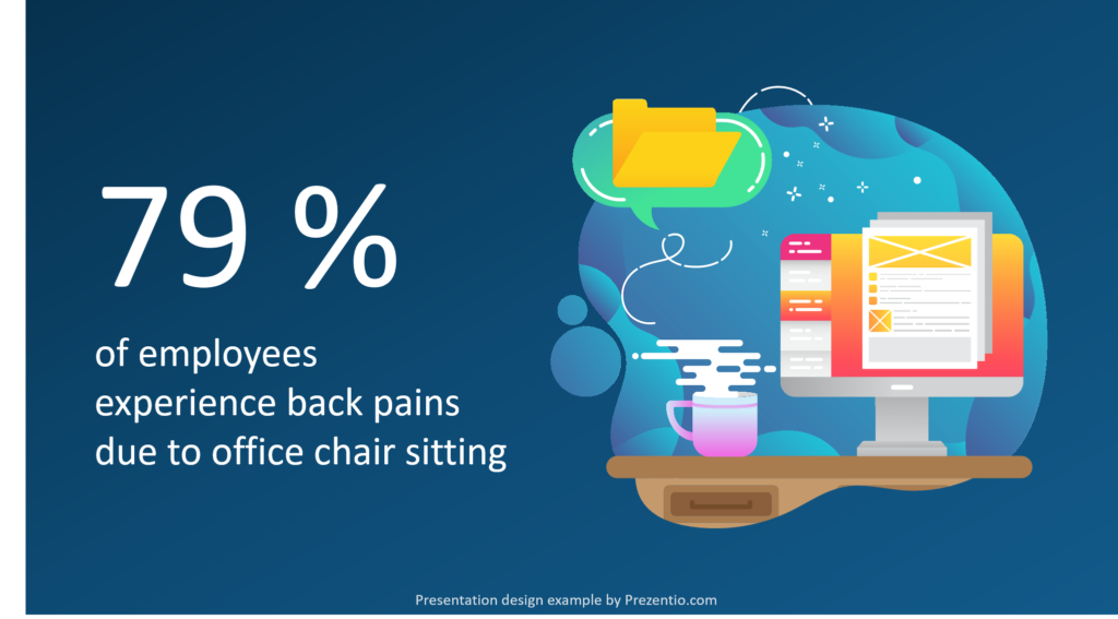
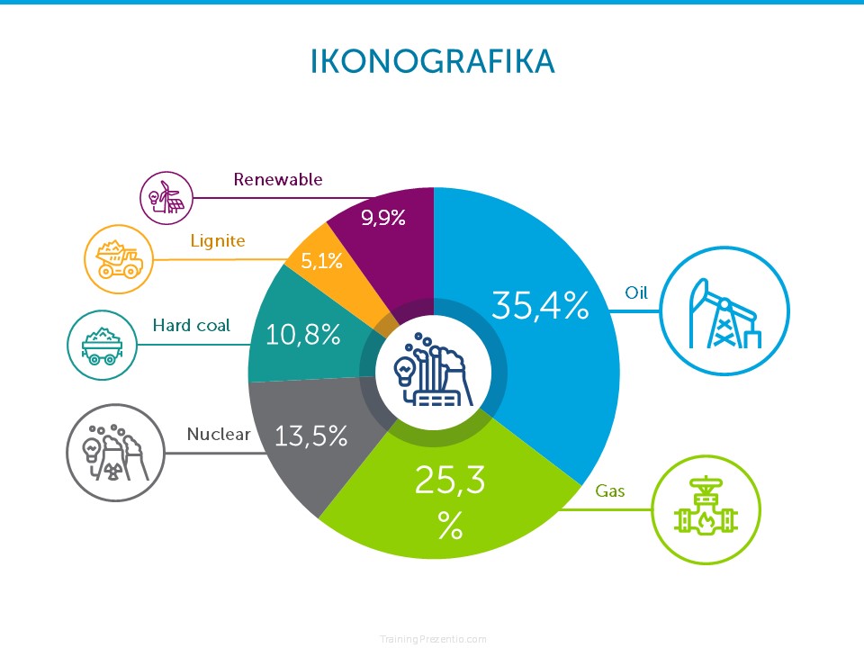
6. Interesting data visualizations
Presenting numbers in attractive and comprehensive is getting a crucial business skill. Not only for data scientists and analysts. Showing charts and tables of data on a slide should be done in an interesting and clear way, not overwhelming, but emphasizing key information.
Expect more creatively designed data infographics and non-default look of data charts on the slides. A lot can be done on top of using standard MS Office charts, like on pie chart example below – adding some additional graphic elements and icons can create a simple yet catchy infographics.
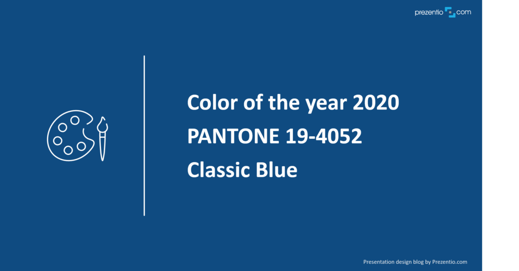
The color of the year 2020
One more interesting trend remark at the end. According to PANTONE company, the color of 2020 is navy blue – Classic Blue. As far as I can tell, navy blue has been very popular in presentations for a while. And this confirms it.
These are the most important directions in presentations world in 2020, in my opinion. Of course, use these ideas as a suggestion and consider also your company’s marketing branding rules and strategy. Anyway, I hope those ideas will inspire you to make outstanding presentation slides this year, too ?
For more presentation graphics know-how and PowerPoint tricks, check our online training on effective visual slides.
I wish you creative and interesting presentations in 2020?
Izabela
Slide & Graphic Designer, Trainer, Founder of Prezentio.