Power of Pictures and Diagrams in a Business Communication
My personal discovery path to visualization
In my previous job (I worked in the IT field, in a data science company), I always admired brochures of other IT companies that contained a nicely designed schema visual. Such materials stood out, especially in the field of IT, where it’s common to write lengthy articles.
Later I started adding more and more such visual diagrams in brochures and presentations I produced. And I could see a huge difference. The materials were easier to understand, plus they have been more eye-catchy. From that moment I discovered that this is a thing, I want to work on. To help other people communicate better using simple visuals.
When I discovered and read a book by Dan Roam: On the Back of the Napkin, I found there is a whole movement in this direction.
I am glad that today it became my hobby and profession too. I run my own company, changing texts into visual diagrams. I am happy when I can apply this visualization passion within our presentation slide design projects, teaching it or creating tools other people can reuse to create their own diagrams.
I believe such concept visualization is a very needed skill for any business communicator, be it a manager, marketer, or salesman. My personal mission is to encourage others to draw on every occasion. Just to name a few:
- When explaining ideas to clients or colleagues over a table
- When making a presentation at a team meeting
- When presenting to a wider public, at a conference or webinar
Many names, one message
Using drawings and pictures in business communication has different names and forms:
- visual thinking
- sketching
- information visualization
- data visualization
- simply drawing
- visual problem solving
- flipping
- slide design
- …
In all those fields, there is one core idea behind them:
A picture is worth a thousands words.
It’s a well-known saying. However, we keep on forgetting it. And the results are numerous “Deaths by PowerPoint” :). Because of a lack of time, we create quickly heavy text-only slides. Look at this research done of over 1000 people, which reveals that majority of presentations are considered to be boring.
But there is a cure for such presentations. Enriching by a visual representation of the content – adding pictures, drawings, and diagrams. It’s not that hard and time-consuming. As Dan Roam mentions in his book, we are born artists, drawing is more natural for us than writing. Just as we got older, we forgot to use it.
However, if we want our article or PowerPoint presentation to pass the message, it should be easy to consume.
The easiest form of visualization
Visualizations can have various forms:
- photograph pictures – great for adding emotion to a presentation, to set a mood. However, they convey less information.
- data visualization – Excel charts, data tables,
- typography – the text itself can be used too as a way to convey additional information, e.g. various fonts can create a different feeling (formal, light, heavy, handwritten). Some examples of using handwritten fonts in a presentation are in this article.
- diagrams – various flow charts, organizational charts, structure visualizations, or simple infographics.
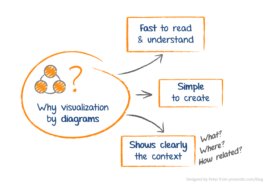
I focus on using simple diagrams. Why diagrams?
Because diagrams are a form of concept visualization, that everyone can create. Everyone can draw a rectangle and arrow, can’t you?
If you need some hints, check my Slideshare below.
And what do You think about using pictures in Your presentations?
What’s your visualization form do you use the most? I’d love to hear your comments.
Peter