3 Diagram Mistakes to Avoid in a Presentation

If you are presenting a complex topic or writing an article on how something works – then diagrams are a visualization tool worth using. Diagrams are a great tool for explaining processes, dependencies, or structures of any kind.
What do I mean by the diagram? A simplified definition would be:
diagram – any geometric symbolic representation
of information.
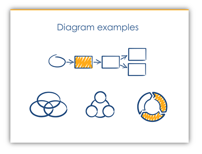
Or more boldly – a set of items (e.g. rectangles) and relations (e.g. arrows) illustrating a concept, like these:
In the world of typical text-heavy presentations, any slide with a diagram is king :). It will attract more attention than others. However, there are some typical errors we tend to do, especially when preparing a presentation under time pressure.
Here are three hints to ensure your diagrams will be professionally looking. The hints are based on some basic graphic design rules and they only take a few minutes to use.
1. Lack of white space on a slide with a diagram
Firstly, check if the slide with a diagram is not too crowded. Is there enough margin-empty space around the diagram? Can you slide “breathe”?
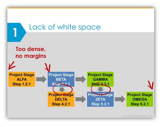
From the usability point of view, it’s better not to fill slide from edge to edge, not to write text inside from border to border. Have a margin. If needed split the diagram into several slides.
2. Diagram Layout – Incorrect position of diagram shapes
Does your diagram look tidy or a bit chaotic, are the shapes well aligned?
Check the layout of diagram shapes – verify the alignment of all your rectangles, arrows, and circle shapes. Are they vertically or horizontally aligned? Are they equally distributed?
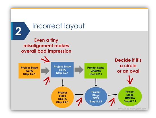
Even a small misalignment creates a bad impression of your presentation. Use the alignment tools or smart guides that are present in PowerPoint. It takes only a few seconds and the result is immediately visible.
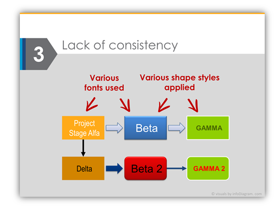
3. Inconsistent diagram styles
Check how many colors, fonts, and fill patterns are there in Your diagram. Not too many?
The diagram illustration (as well as the whole presentation) should use a limited set of styles and fonts. To be graphically unified. It’s better to choose one style of diagram filling (simple flat, an outline of one color or none, the same shadow type or none).
Use also one – two fonts. Don’t go wild here. Avoid obsolete-looking fonts such as Times New Roman, and Comics Sans. Arial is also getting too default font. If you want to go for safe readable fonts that are present on every computer go for Calibri, Calibri Light (on Windows PCs and in MS Office apps), or Helvetica (for Apple system family). If you want to be different (some fonts require to be installed separately), then my font tips are Lato, Segoe UI, and Open Sans.
That’s all – simple three things to remember when you will be creating your next presentation: White space, alignment, and consistency.
- White space between and around the diagram
- Alignment of all diagram elements
- Consistency in design (fonts, colors, shape style).
Check the full presentation with diagram mistakes and improved slides my SlideShare:
Do you have diagram challenges you want to solve? Or advice to share? Let me know in the comments.
Peter