Presenting Data Tables in PowerPoint as an Interesting Visual, not a boring Excel Block

I was asked several times how to make Excel tables look attractive inside your PowerPoint presentation. This issue becomes even more challenge-full, when you have a dense table and you are under time pressure.
I deal with such task a lot in my presentation projects – How to make financial charts and tables more visual? How to make it eye-catchy yet still readable? How to make sure people see there the same important data you want to show?
Here are a few quick slide design tricks I suggest:
1. Use colors to show data importance
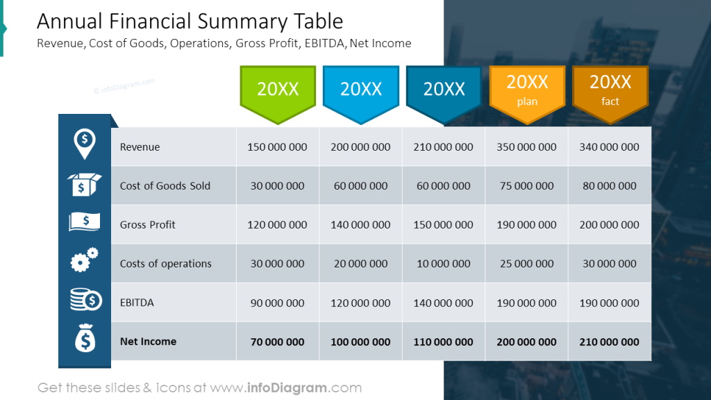
Not all table cells are equal. There are usually special rows with total revenue, final profit after tax or subtotals of costs summaries that present more important information. This is worth to highlight also visually. There are several simple ways you to do it:
- make text inside this cell bold or use different color
- apply different background color
- make cell grid thicker or double line
- add a arrow pointing to the cell you want to highlight
Therefore what you can do after copying Excel table into PowerPoint, is to adjust colors of the table cells or rows to distinguish more and less important data. How to do it?
- Select a row or cell from the table inside PowerPoint
- Go to top menu, open Table Design tab
- Select Shading to change cell background, for example.
Use color that will ensure there is high contrast between table cell background and cell text. Consider using negative color coding (e.g. dark blue background and white text) for the key table rows.
Similarly you can adjust grid lines, using Borders option from the same menu tab. However here you need first to select pen color and line thickness. Here’s example of a table with highlighted last row:
2. Converting tables to other forms
Consider changing your data presentation from a tabular form to another better data visualization form – for example data charts or diagrams. Data charts are quite obvious form of table visualization, in case you have numeric quantitative data.
If you have a time you can redesign default charts to something more visually original and attractive like those below:
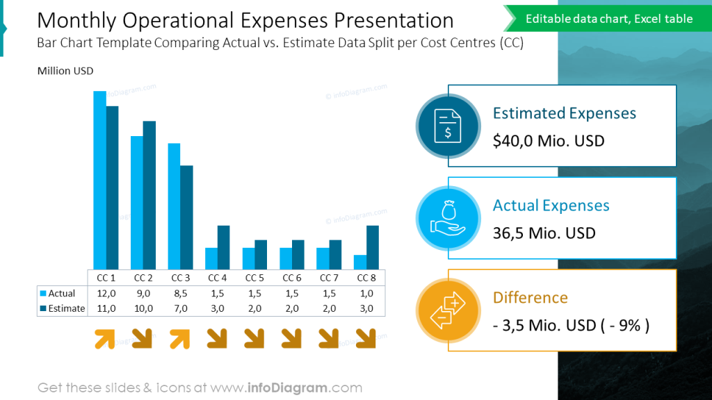
Here is a slide with standard bar chart with added custom designed legend:
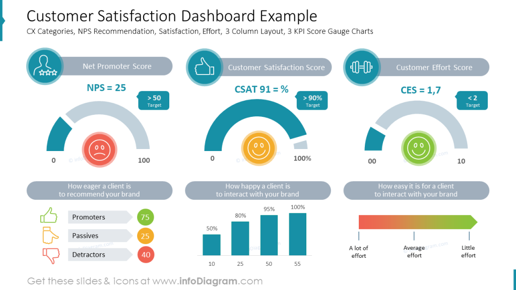
And here you can see a dashboard slide with several charts together:
- showing status data in a gauge chart
- expressing levels in a bar chart
- illustrating data chart categories with icons and colors
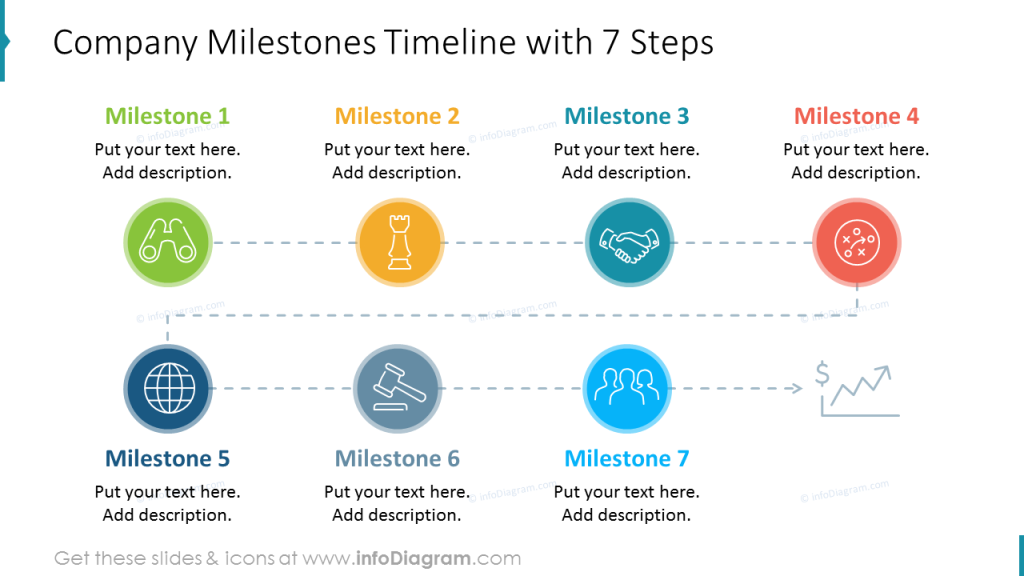
In case you have a financial plan, that presents a sequence of milestones in time you can use a timeline diagram infographics rather than a classical table.
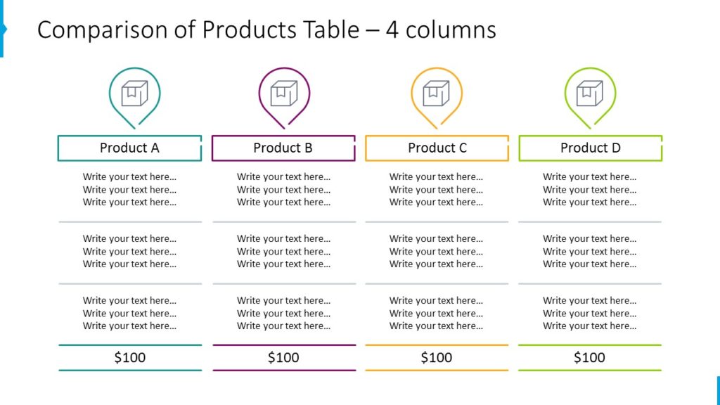
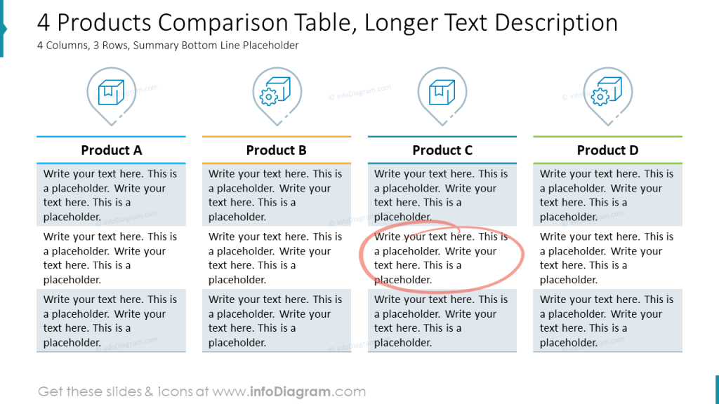
3. Creative enhancement of table columns with custom graphics
To make a standard table look creative, combine it with additional shapes. Add graphical elements to column headers – a specific icon if you have a space. Or make header as a separate shape over the table.
See example slides below:
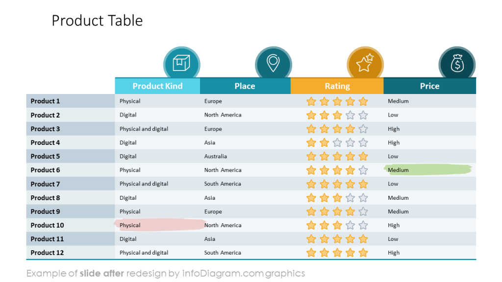
4. Show where to look in a table
Highlight the key financial values – e.g. use a hand drawn arrows or swoosh to circle the key data. You can make them using PowerPoint pen tool, simple shape or some shapes.
Here we added also highlighter markers – green to underline good information and red marker for bad information.
Resources to learn and do more
To learn more tricks how to make visual presentation slides and get practice, consider joining one of our online training or coaching:
- online training workshops – on slides design, advanced PowerPoint or data visualization,
- personal coaching, redesigning your slides together – ask me for details,
- article in data chart mistakes to avoid.
To get graphical resources you can use to enhance your presentations, check:
- Creative Table Designs and Highlighters – PowerPoint template
- Business Tables and KPI PowerPoint template
- search through other PPT templates on our infoDiagram platform.
Books for further self-study and reading
- Data Story by Nancy Duarte
- Say it with a Charts by Gene Zelazny
- Slide:ology, Nancy Duarte
I hope that gives you some ideas for start.
PS. If you have any slide design related question, contact me, I’d love to help.
1 thought on “Presenting Data Tables in PowerPoint as an Interesting Visual, not a boring Excel Block”
Comments are closed.