How to be Creative and Not to Take Too Much Time? [PowerPointer’s Q&A]
Hey, presentation makers :). I’m starting the series of answering your questions, about various PowerPoint and presentation issues – from design tips to “where to catch inspiration” challenges.
The first question I’ve got here is about the tricky combination – Creativity and Time: How to be creative and at the same time not put a lot of effort into it?

My two quick suggestions would be:
1. Creativity can be awakened in everybody.
We are all creative, just remember your childhood when you used to draw. To get some scientific reasons why drawing has escaped from our lives, check the book by Dan Roam On the Back of the Napkin.
The same principle (about being creative by drawing first) applies also when you are preparing PowerPoint slides. You just need to forget the Office software and its all features for a while.
Try this exercise:
Firstly sketch your presentation on a paper, draw a structure, draft slides manually before moving to a computer and see how your mind thinks more freely without it.
Now look at the paper for a minute. Does it all have a sense? Is the flow of drafted slides ok? Would you add something? Make written notes on how would you explain a specific slide content. Write, doodle, erase… Go wild 🙂 the paper will stand anything.
2. Apply a creative-look
Once at your computer, the trick is to make it look creative. Simply add a few graphical elements associated with creativity:
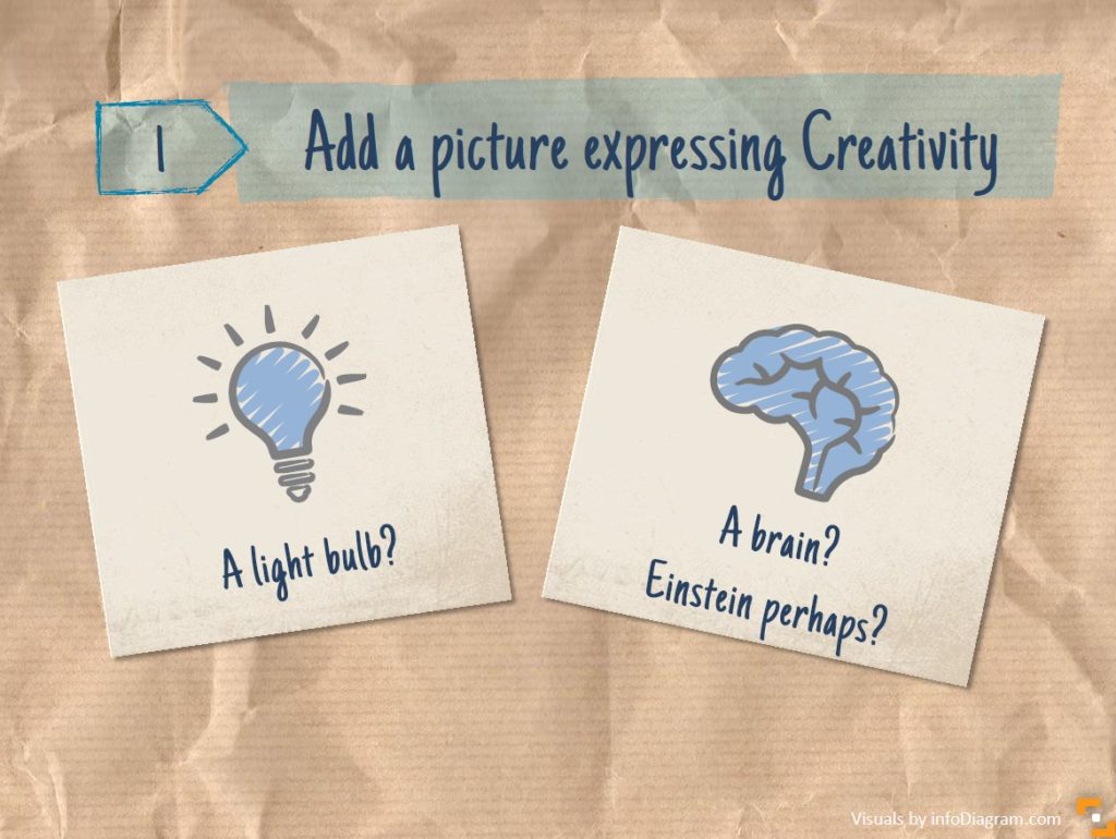
- add an unusual image, don’t use not cliche illustrations or the first photograph that you will find. Search for metaphors of creativity – art, paintbrush, color stains on a canvas, pictures of known creative people (Einstein would be the most obvious for me, but try also others Andy Warhol, Mozart, Gaudi, J.K. Rowling, Steven Hawking, Neil de Grass, Picasso, Steve Jobs…)
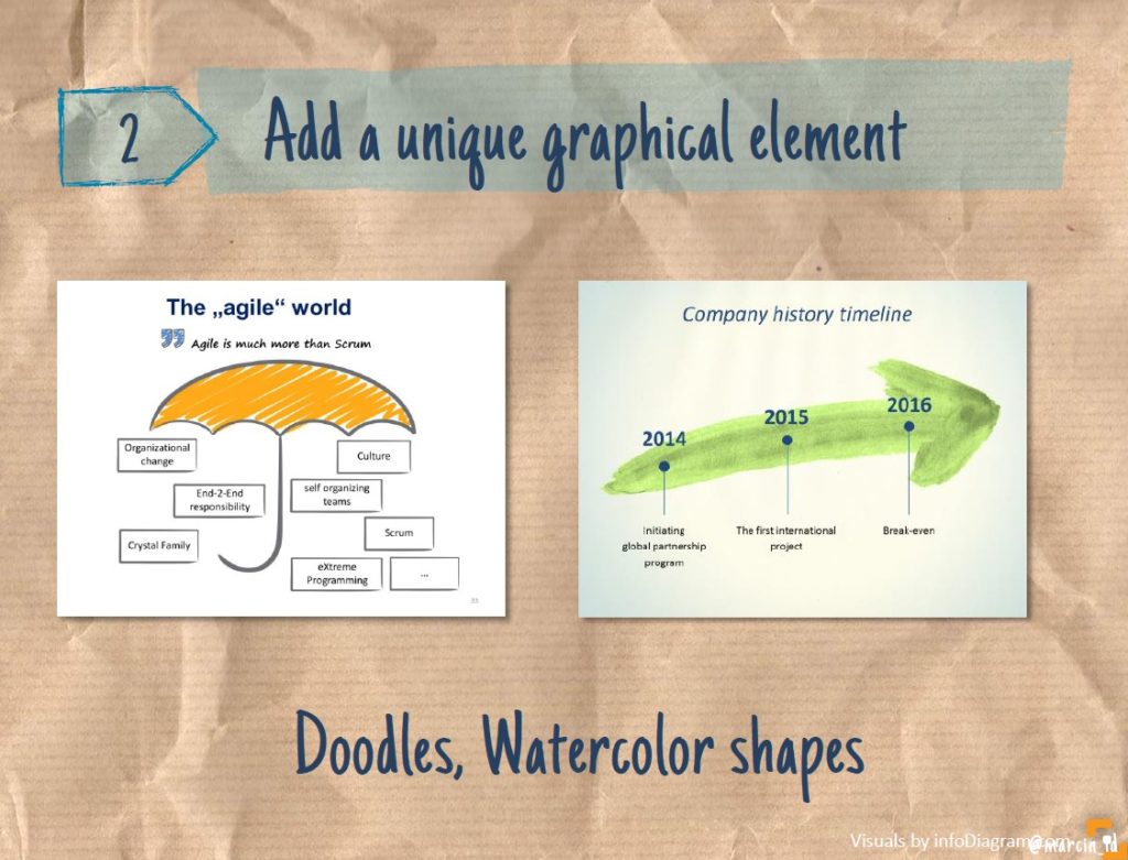
- use sketching or hand-drawn shapes for diagrams
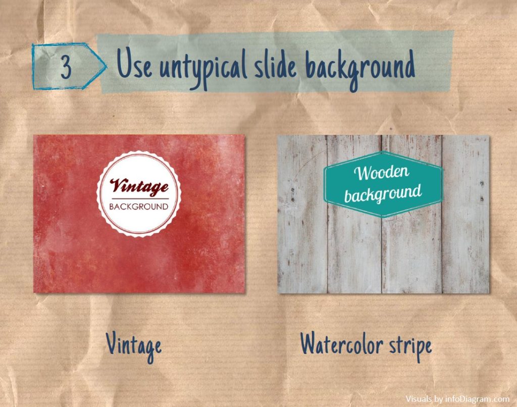
- add watercolor illustrations or change the whole presentation template to use a non-corporate look. See these blackboard slides for inspiration.
- sometimes using slides with lots of “white space” (big empty places, only a little text, 1-2 words on a plain slide) can also look creative. Think of Apple’s design.
Here are a few examples of how you can use creative elements within your slides:
- add a picture
- incorporate unique elements and shapes
- apply creative background
So, to get creative I’d recommend four particular steps:
- Put computer away
- Stay simple, declutter
- Use a graphical style associated with creativity
- Look around for inspiration
Read more about this topic in this article How To Be Creative When Preparing Presentation.
I do hope these ideas will help you add a creative touch to your next presentation slides.
Write your presentation or slide design question in the comments or contact me directly, I’ll be glad to answer you 🙂
Peter
