How to Present with Diagrammatic Format [PowerPointer’s Q&A]

Hi! My series with your Questions and Answers continues. Today I’m answering the second frequent question I get from you: how to explain something using the diagrammatic format and make presentations easier to understand.
Firstly congratulations that you want to use diagrams right from the start. Diagrams are excellent visual tools to use, so much better than a text-only slide.
To properly use diagrammatic, to explain your slides with diagrams, I suggest following these steps:
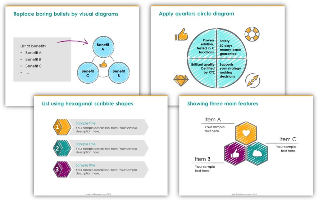
1. Replace the text keywords with shapes with text inside
Firstly identify the key concepts you have in your text. Usually, the presentation is about some kind of problem-cause analysis or a solution report. Maybe it’s about a product that has several key features or benefits you want to present.
Even if you are presenting an abstract idea, there is some structure of key arguments, reasons, and action steps that can be identified as key points of your talk.
Those key elements can be quickly organized into shapes. And then we are only a step away from having a diagram. Just add those shapes to a layout that best represents the information you want to convey:
2. Then think about how those shapes can be organized
Take a minute to think about the way you can present your content. Is it a sequence of information? A kind of process flow? Or is there some structure inside – a hierarchy or a map of some kind? It can be an abstract map of some concepts related to each other.
You can put those concepts on sticky notes and move them around – do they create a sequence? Put them in a row, in a timeline. A hierarchy? Stack them. Are they not related? Distribute them randomly. And so on.
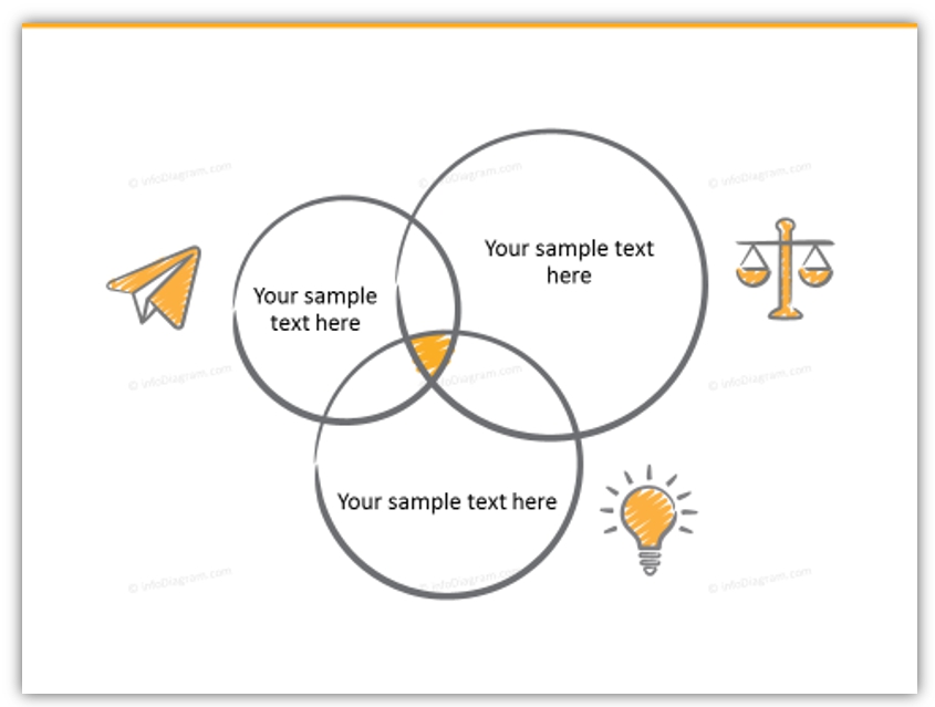
The most typical diagram type is the Venn chart. It illustrates a common joint element of various concepts:

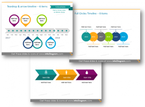
In case you have a sequential type of information (here we can include all types of instructions, procedures, step-by-step guides; or various timelines, and histories), you can use an arrow diagram, for example:
A few more creative timelines for inspiration, I created from scratch using PowerPoint:
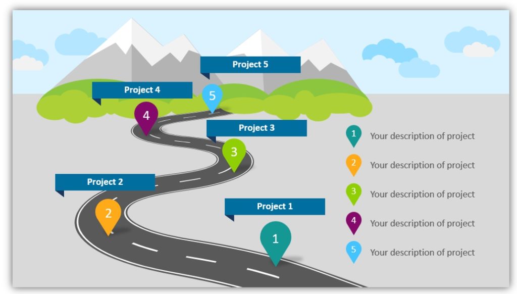
A roadmap is a more fancy way of presenting a time. Here’s what the roadmap slide can look like:
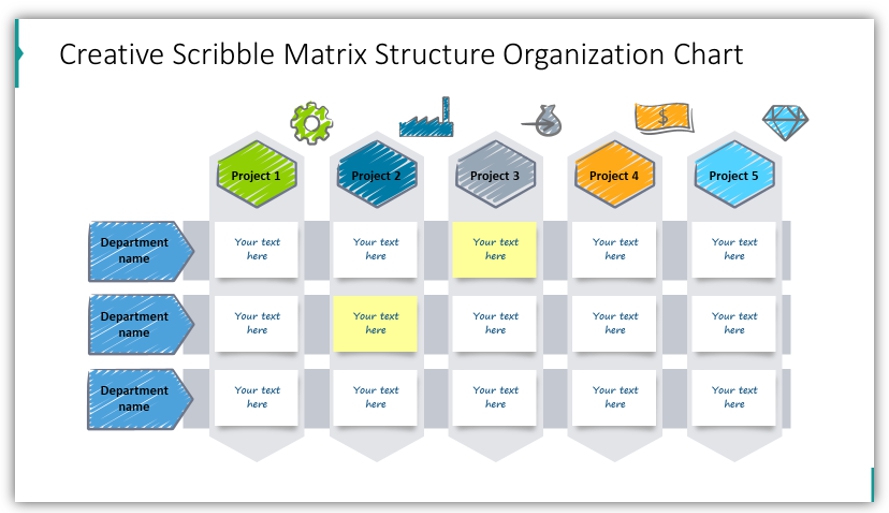
Another example of a different diagram structure can be an organizational chart, for example, a Projects Matrix diagram:
3. Proper presenting the diagram
Having your presentation slide with a diagram, it’s quite easy to present it in a more interactive lively way, than a text slide.
You can add a simple animation to each diagram element, so they appear as you speak. Or in groups according to the diagram’s logical flow.
An important remark about diagram design – for a smooth and professional look, I recommend using a consistent graphical style. Don’t mix too many fonts, or colors. And remember about basic good design rules – white space, slide margins, alignment of diagram items.
See my guide for making a professional diagram and 3 common mistakes to avoid.
Use diagrams wherever you can
Even if you won’t create perfect diagrams from the start, keep on using them. You can draw them on a flipchart during a meeting, or use them in your sketch notes. They are indeed a great tool for visual thinking, supporting understanding and better communication of your ideas.
Apply these steps to create simple diagrams for your presentation and share in the comments your experience 🙂
Write your presentation or slide design question in the comments or contact me directly, I’d love to share my experience.
2 thoughts on “How to Present with Diagrammatic Format [PowerPointer’s Q&A]”