Good-looking Presentation Visuals by Non-designer [PowerPointer’s Q&A]

The next popular question-challenge of every presentation maker – is how to create attractive visuals if you are not a designer.
The trick is to replace text information with some graphical form.
Slide Design Visuals Types
The typical visuals you can consider using are:
- photographs
- charts and tables
- clipart illustrations
- diagrams and infographics
The most common visuals used I see applied in PowerPoint are photographs. However, the pictures have limited “explaining power”. They are good as an addition but hardly will replace the text content. The same goes for presentation clipart and icons themselves. Therefore I suggest using also other visualization tools.
Charts and tables are suitable when you have numerical information to present. Here’s the article if you want to get more tips to make creative looking data charts.
But let’s assume your presentation is not about numbers but more general concepts. If you have rather qualitative information to present (like a product, a service, or procedures), then consider using diagrams and infographics.
How to make diagram infographics using PowerPoint
Make use of the tools that PowerPoint offers. If you want to go quick, use the SmartArt graphics tool. Alternatively, create your own diagrams using standard shapes. This requires a bit more practice and imagination, but the results will be more unique. You still can get inspired by checking various infographics PPT slides collections.
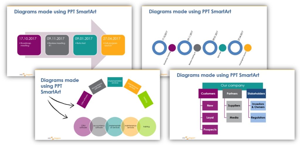
Even if using SmartArt, you will be surprised how many various diagrams and visuals you can create out of it (and not only standard and ugly 🙂 ). Here’s an example of diagrams made only with the help of SmartArt:

With some small tweaks, you can create nice visual that pop.
A quick guide to making good-looking visuals by non-designer:
1. Choose a diagram type that fits the story you want to tell
Is it a linear process? Cycle? Hierarchy? A list? Or intersecting Venn diagram? There are plenty of various diagram types, try to choose one that will reflect the information in the best way.
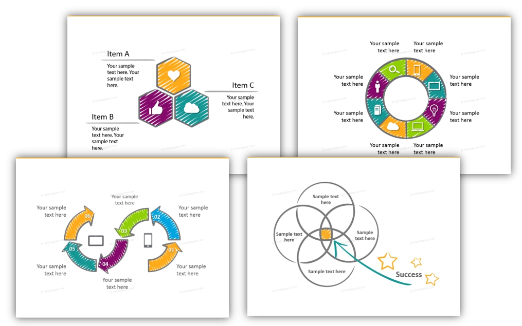
Here are different diagram types you can apply to your slides:

2. Use a vivid color set
Default SmartArt is using PPT template palette. Chances are you are using one of the default Microsoft Office color sets. However, they are not very bright. The result is a monotonous diagrams color. To create more engaging visuals, use a more vivid set of colors. Either select a better Office palette, adapt it, or create your own.
Design tip: Avoid using preset styles with strong gradients and 3D bevels. They look pretty obsolete and are less readable. I recommend using flat shapes (1st style in PPT SmartArt styles), to get a modern look.
You can set the colors of SmartArt manually, one shape by shape. If you have your logo book, add colors from there to create a consistent presentation with your brand.
You can also get our color palette, where we added modern violet, fresh green, and yellow colors. Get it from our free Creative Shapes template. and using that file, create SmartArt. It will have the same color as the examples above.
3. Facelift your diagrams using symbols
Adding a thematic icon symbol to each item of the diagram will help you create professional atypical infographics.
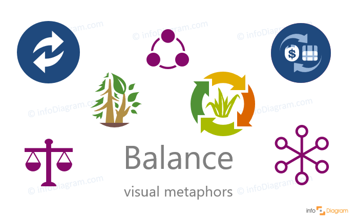
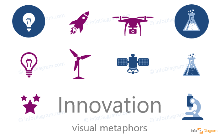
I have put together a list of a dozen of abstract business Concept Icons Ideas. Check it to see what symbols to use to illustrate concepts like strategy, innovation, flexibility, deadline, or risk:

Design tip: stick to one style of icons, don’t mix various styles such as handdrawn and flat symbols. Remember good design is about being consistent and readable.

Even if your diagrams won’t be ideal from the start, keep on trying to use them. See our other blog about How to Present with Diagrammatic Format to learn to explain something using diagrams and therefore make presentations easier to understand.
If you have any slide design questions, leave them in the comments or contact me directly, I’d love to share my experience.
