How to represent data in different ways [PowerPoint Q&A]
I was asked about how to represent data in different ways in a presentation.
A quick answer I’d suggest is to consider presenting data in several ways:
- if you have 1-6 key numbers you want to show, write them big on a slide. Don’t just list them as bullet-points – it’s better to position each data as a separate text and apply e.g. matrix layout – for 4 numbers 2×2. Add an illustrative icon representing your data meaning.

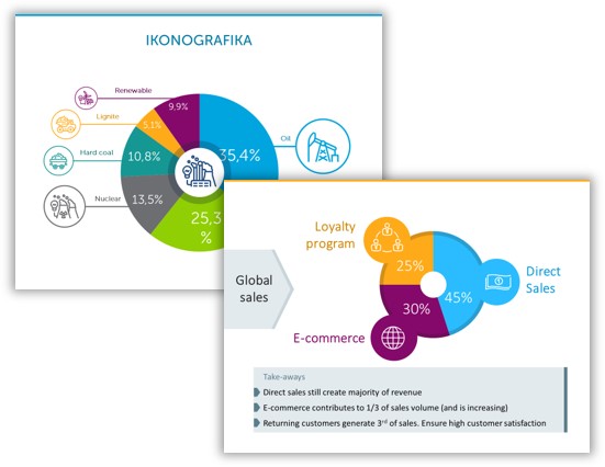
- If you have a series of data, then data chart or data table is an obvious form. You can enhance the chart by adding an icon like here:
- Try to use an infographics layout (a roadmap if your data represent a journey, a story, or comparison columns)
For inspirations, here you can see some PowerPoint slide decks with timelines and roadmaps here.
In your next presentation let’s try apply some of those three ideas.
If you have any slide design related question, share in comments or contact me directly, I’d love to help.