How to make a Creative Pie Chart in PowerPoint

Do you use pie charts in your presentations? I see them often in presentations I help to re-design. However, mostly they are in their default form. Let me show you how you can make this data chart much more attractive.
MS Excel and PowerPoint give you a wide range of choices for visualizing data series with charts. Pie charts are one of the most used chart types. They are quite popular due to their simplicity and I would say also because of their nice visual look. The circle shape looks attractive. However, pie charts should be used in the right context.
An important note about pie and doughnut chart use
Following the best practices of data visualization, pie charts are OK to be used if:
- data are creating a whole, e.g. market shares in % of the whole market. Or product sales shares overall sales together.
- you want to express only general shares value. Pie charts are not very good for precisely showing value differences.
- you have a limited set of data variables, to keep the pie chart readable. Don’t use it if you have over 6-8 categories. In this case, it’s better to use a column or bar chart.
Assuming you follow those pie chart use recommendations, let me show you how to present a pie chart in a visually attractive way. In our example, this will be the distribution of product sales.
I’ll show you how to turn a standard pie chart into a creative and eye-catching infographic
For more tips and skills check my online workshop on Data visualization in PowerPoint,b where I teach how to quickly create professional data charts and tables.
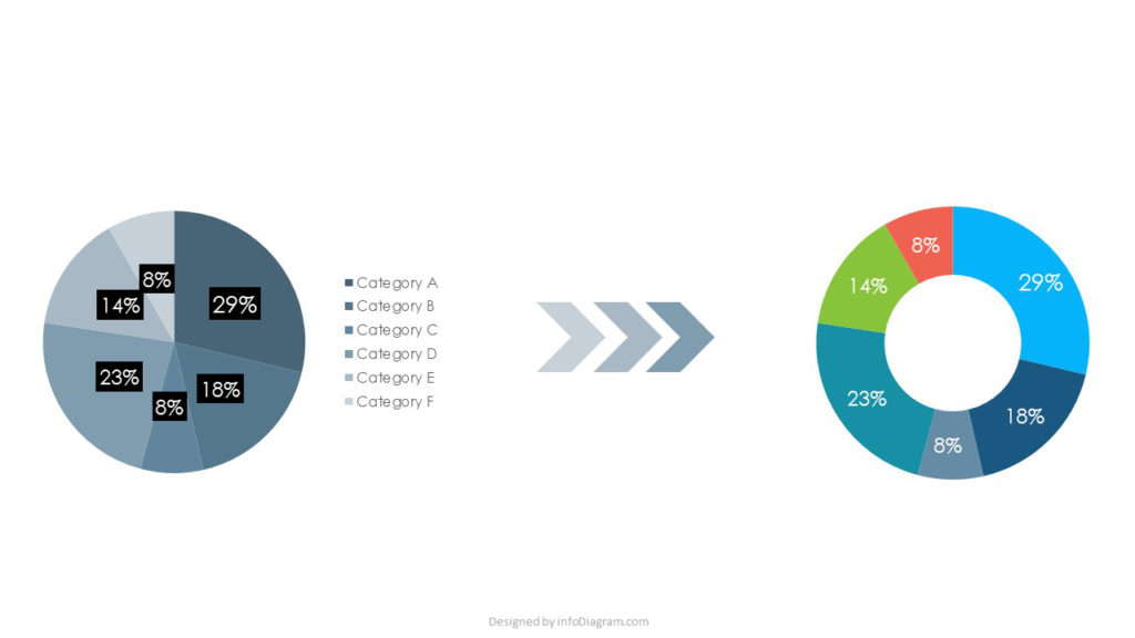
Pie chart transformation made in PowerPoint
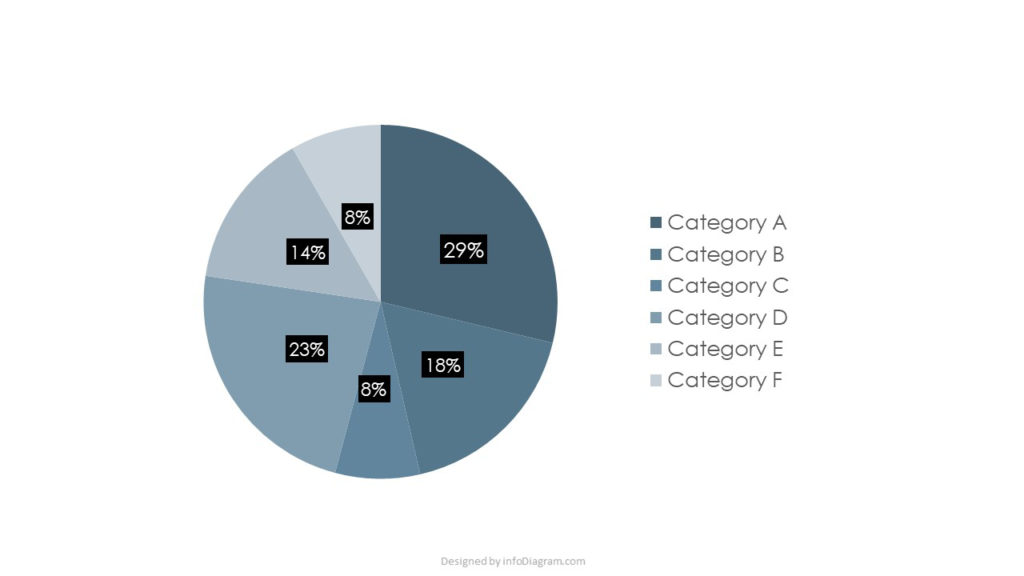
Let’s see how we can change a boring default pie chart to an interesting infographic. Here’s my source data chart – a graph representing shares over several categories.
Here’s the same pie chart transformed into much more attractive graphics. Notice what effect has adding a few more colors, using visual elements and graphical metaphor.

Does it seem complicated to create such a data chart? Don’t worry, it is rather simple, I will use only standard PowerPoint shapes and a bit of creativity.
1. Adjust the pie chart look first
Start with changing the pie chart to a doughnut chart – with a hole inside. In PowerPoint, you can find the chart type function under the Chart Design tab. There you can also alter the chart color – either selecting one of the proposed color combinations or using your own colors. Then turn off the default data legend – we will create our own customized version later. You can find all chart editing elements when you select a chart and open the context menu with a right mouse click.
2. Creating an illustration of a lock from PowerPoint shapes
Now let’s create a simple illustration made of shapes. Create elements following the picture below – circles, a triangle, and an arc. You can find all those basic shapes in the PowerPoint Insert Shape tab.

Putting those shapes together with proper layering will create a shape of a lock, that we will use for our data chart. You will need to create a lock hole merging a small circle and a triangle. One of the middle circles should be semitransparent to create a look of partial color overlay.
Align all circle objects centrally to make a symmetrical lock.

The last step is to put our doughnut chart over the lock graphics. The middle circles with a keyhole should be put on the top of the chart. Use the right mouse click and the “Bring to Front” function for that.

Not that hard, isn’t it? PowerPoint can give you really lots of possibilities for a creative design. All you need is an idea.
3. Create a graphical legend
Let’s enrich the new chart with custom-made legend, as an alternative to classical legend provided by Excel charts. It will take you a few more minutes, but the effect is worth it.
Again, it’s enough to combine several basic shapes – rectangles and triangles – to create a ribbon for every data category in the chart. I propose a ribbon shape that has a space for an icon and colorful stripes. Assign different colors to each legend item, following the same color coding as in the data chart.
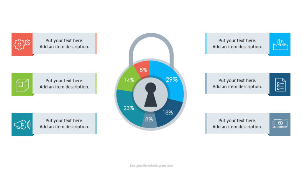
if you want also to assign one icon to the chart itself, remove the middle keyhole part and place there your icon representing the chart. Feel free to play and experiment further with this chart graphic, until you are happy with a new design.
Further sources of PowerPoint graphics and inspirations
You can get this slide graphic, the icons I used, and more illustrations from the infoDiagram library of presentation graphics:
- Vector icon set: Outline Business Icons for PowerPoint infographics.
- Finished editable pie charts: PowerPoint Data-driven Charts Templates
I hope my example of a lock-shaped data chart will inspire you to create more visual slides for your presentation. Check my other blog articles with PowerPoint tips and tricks. Sign up for my newsletter at the webpage footer, not to miss new posts.
PS. Want to learn more about making effective visual presentations? Join my online Slide Design workshop here.