Five Data Chart Mistakes to Avoid in Presentation

How to present data on your slides while keeping clarity and professional look? Make sure you are not failing into one of the data visualization traps. I collected the most common mistakes I see people do in business presentations. Especially when they present data from various Excel charts copied to PowerPoint.
How to avoid those typical data visualization mistakes? I am sharing a few quick tips how you can handle those mistakes.
This is a fragment of our training workshops. For more details see our Online Trainings on Presentation Design.
1. Inappropriate data chart
This is first question you should ask yourself, when you want to present numerical data. It’s an essence of proper data visualization. What chart type fits your data? A bar chart? Column chart? Line or pie chart?
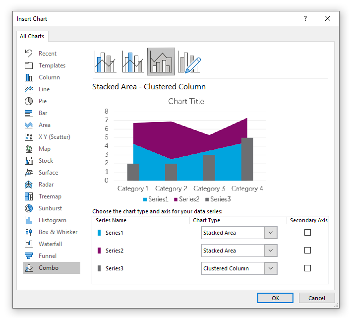
If you are using MS Office applications for working with your data, Excel and PowerPoint offers a dozen of data charts you can choose from. Microsoft slowly keeps adding new charts, e.g. from Office365 included fancy looking Sunburst, Funnel or finally Waterfall chart.
Choosing the data charts depends or three factors:
- what data you have
- what you want to tell with your data (a trend? to compare? to analyze?…)
- who is your audience.
The last item – the audience is the most deciding factor in context of presentation design. In most corporate presentations I worked with, people need to explain data to their managers, to a board, or in case of educational presentations, to students. All those cases concern audience that is probably not expert in data analysis. So even if you are an analytic who understands deeply data, and can do a complex statistical analysis, your presentation should be adapted not to your skills but to your listeners.
For most of presentation purposes you will need to use a few basic charts or their versions: Bar (or column) chart, Pie chart (also doughnut or donut one), and Line chart (or area chart). Each of them fits a different purpose:
Line Charts and Area Charts
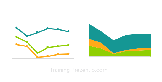
Line chart is best for showing data change over time, For example showing sales trends, website traffic over last days or global warming temperatures over decades.
Area chart: highlights the total amount, the area under the data line, showcasing better e.g. total sales volume across a period.
Mistakes I have seen involve:
- using line charts with categorical data put on Y axes (e.g. a specific product). If this data are not linearly depend (such as time), you should not use the line chart.
- another thing to avoid using line chart are showing too many variables on one chart. It will result in hard to read data presentation
- using area chart if you want to present only trend
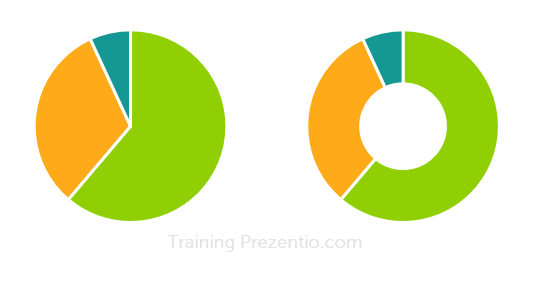
Pie and Doughnut Charts
Those are nice looking charts on shape of circle, that are meant to represent data that compose one whole. Typically a market share or any kind of percentage data e.g. a survey answers distribution.
Logical error in a pie chart is when percentage values do not sum up to 100%.
Visual mistakes I see a lot is using pie charts with way to many categories. From design point of view, to keep readability I’d recommended showing max 6 categories in a pie chart. And order them by value from biggest to smallest. If you have more categories, group last 7+ into one category “others”. And if needed, show this category on other chart.
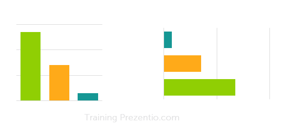
Column and Bar Charts
Those charts represent data value by size of a vertical or horizontal bar. They are suitable to compare multiple categories e.g. sales of various products. Unlike line or pie charts, you can show here also more variables and chart will be still readable.
One thing I would suggest is to use color coding with some business logic behind. Use various colors if you want to underline that variables are different. Apply only 1 color if you want to focus more on values than on variety of categories.
How to choose chart to your data
If the focus of your presentation is to show outcomes in an understandable way, and not to do exploratory data analysis, then it’s better to use those classical data chart. Avoid fancy new chart, that may not be that easy to comprehend by your audience.
Choosing one of those basic data graphs, consider what you want to show:
- Is it a share from some whole part? Then consider Pie or Doughnut chart.
- Is it a trend over a time? Then Line chart is your obvious choice.
- Or do you compare several items? Then go for Bar chart.
- Do you want to show correlation between 2 variables – consider scatter plots. If you want to include also third variable in that chart, then go for bubble chart
- If you present a data breakdown between two border data values e.g. types financial expenses, then use waterfall charts. Sunburst charts are similar, but they can be less readable.
To learn more about data charts I recommend book by Nancy Duarte: Data Story or Say it with a Charts by Gene Zelazny.
2. Unclear reading flow of a data slide
When you are designing a slide with data presentation, indicate clearly how the reader should look at it, where to start and where to follow.
Is the chart title the first thing a reader should look at? Or is it a trend line? A specific data value or outlier you want to highlight? Don’t let reader guess what’s the most important part.
How to tackle reading flow mistake?
Use design elements to lead an eye of a reader – using color contrast, font size or some highlighter shapes – arrow, oval. Remember, natural way for reading the slide is from left to right, from top to bottom (at least in western culture). People will tend to read the slide this way, unless you show the the other way.
Therefore take case your chart objects are aligned for a logical reading flow. This will ensure your slide will be easy to read.
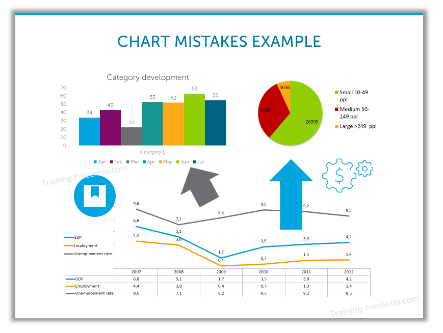
3. Too many data presented on a slide
You may be tempted to show all details of your data analysis, how you got these results, exploring and presenting many data nuances. However ask yourself: Is this a crucial information also for my audience? Presentation should focus on the final result of your analysis and explain it properly.
Imagine there is a limited attention span and people can stay highly focused for a few minutes only. How to do want to spend those precious minutes of their time?
How to tackle data overload issue?
Think twice, whether you need to present all details that led to your final data analysis outcomes. Does the audience need to hear it all? Maybe some parts can be put into appendix materials only?
4. Chart slide too detailed and decorated
It’s good idea to enrich a graph with colors, icons or other additional element. However, each element should have a function. It should add value and not be a mere decoration.
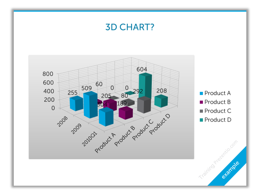
This is another frequent trap in data visualization – having a graph visual with too many too many additional elements. Or using fancy graphs that are not intuitive to understand – this maybe the case of 3D bar charts, or radial charts overuse instead of simple bar chart, if your audience is not used to such charts.
Reading data should not be a quest for a reader.
Cure: Remember “less is often more”. Prefer simplicity over sophistication. If your chart is getting too complex, consider splitting it into more charts. Show one variable at a time. Use color coding to highlight only the most important parts. Consider not showing some data labels if they are essential for data understanding.
5. Unclear presentation goal
This may not be a strictly visual mistake, but it influences all data presentation challenges I mentioned above. You may have super looking data charts, clear to understand, but if your audience asks at the end “Nice, but what is it good for?”, then the presentation may be wasted time for you and audience. Therefore, think about it before you start making any data visuals.
When putting together a presentation, make sure you know what is your goal, what you want to achieve by showing your data. What’s the story and morale behind data?
Cure: Define the goal of your talk before preparing the presentation. Write it on a paper, white board in the office to have it in the front of your eyes when working on slides content. State it at the presentation beginning, too, so your reader knows what to expect.
Consider structuring your presentation using 4MAT questions model or AIDA flow (Attention, Interest, Desire, Action) – here’s article with using AIDA slide examples.
Summing up data presentation issues
These were a few of examples where data presentation can go wrong. Realizing those risk areas you can think how to tackle them properly. There may be more, of course. A lot depends on your context – are you presenting to experts or novice audience, are you a skilled professional speaker or are you starting the path of presenting.
You don’t need to be a data science Ph.D. expert to use data charts properly. In data visualization, a lot can be done using a few rules of graphical design (contrast, alignment, or consistency). With proper use of colors and PowerPoint shapes can create visually attractive data plots. You can enrich them with additional elements that will help a reader in faster interpretation of data categories.
If you want more learn more, check my data presentation training where I share more ways you can enhance data charts and make your presentation slides attractive.
Need a further help in slide redesign – reach out to me, I will be glad to talk.
Peter
Concept visualization nerd :), Slide Design Trainer & Designer
1 thought on “Five Data Chart Mistakes to Avoid in Presentation”
Comments are closed.