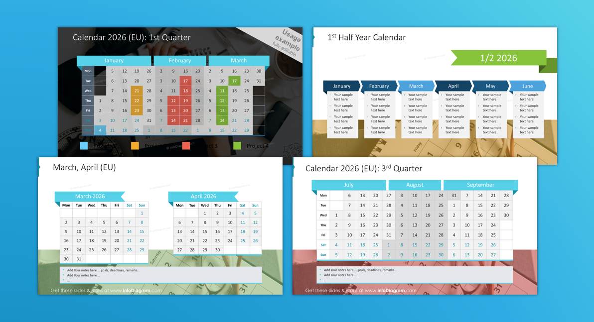
Besides running our presentation design business, occasionally I do consulting on education and entrepreneurship.
Here are resources from Life Design sessions I organized in 2025 for worldschooling community in Spanish Andalusia .
(more…)Besides running our presentation design business, occasionally I do consulting on education and entrepreneurship.
Here are resources from Life Design sessions I organized in 2025 for worldschooling community in Spanish Andalusia .
(more…)Besides running our presentation design business, occasionally I do consulting on entrepreneurship and marketing.
Interested in consulting on business development or presenting on those topics?
I gladly share my experiences with launching and running a business. Contact me (best via my LinkedIn).
Here are resources I recommend for running a newsletter:
(more…)Information for people who want to explore the area around Andalusian town La Herradura, known for the world-schooling hub.
It should help you decide:
Keeping employees engaged and continuously enhancing their skill sets is an ongoing challenge. In particular, younger generations entering the workforce have high expectations for training opportunities that are practical and immediately applicable to their work. One highly effective area to focus on is the art of creating visually compelling presentations.
Based on my experience with designing slides and delivering training to various businesses, I collected here main reasons why investing in visual communication training combined with improving PowerPoint skills can bring a significant benefits to your organization.
(more…)Designing readable and interesting data charts is another practical topic of our Academy of Visual Communication.
You will meet with data charts not only in PowerPoint, but in Excel sheets or other software.
The tips I am sharing below include generic data visualization rules that you can apply for whatever tool you will use.
Go through those short videos to learn about data visualizations and see examples of data chart visual enhancements – done mostly with PowerPoint only.
What are common PowerPoint chart mistakes? See an example so you can avoid it.
Let me present a trick how you can quickly facelift data chart without much design work.
Office data charts has several options you can tweak to make them look better. Default chart not always use the best setting. On the video below I show what chart option is worth to change.
And here I share a way to enhance charts with adding some new graphics, to make them look visually more attractive.
The best way to learn creating attractive data charts is by doing.
We have set of exercises you can try at home or within our online training. Explore learning options within our Visual Academy.
Check my example of highlighting outliers in bar chart using PowerPoint shapes:
Another example shows how you can makeover of dashboard slide with data charts:
Example of financial dashboard presentation – visualizing KPI data:
Whatever data chart you have, apply this check to ensure your data chart is good enough to present.
I hope those inspirations get you started on creating data charts that will impress your audience.
Get more practice – with our supervision, consider joining our Slide design Masterclass training or coaching.
Summer in the office can be a pretty lazy time. There are fewer urgent projects running, it’s a low season for sales, fairs, or conferences. Half of the staff are on holiday anyway. However, for the marketing department, this is an ideal time to prepare for the busy last quarter.
(more…)Besides running our presentation design business, occasionally I do consulting on entrepreneurship and marketing.
Contact me (best via my LinkedIn), if you’re interested in consulting on business development or presenting on those topics. I gladly share my experiences with launching and running a business.
Here are resources I usually recommend to check to get you into entrepreneur mindset:
(more…)Are you struggling to email your presentation because PPTX file is too big? Experiencing sluggishness with large files on a slow computer? Then you’ve come to the right place to discover a solution!
(more…)
For some time, the topic of Artificial Intelligence and ChatGPT application has been igniting the imagination, stimulating minds and is a great topic for conversations. Recently, during the training, someone asked how we can use modern AI achievements in presentations. I decided to write a little about what can help us, where so far it does not give advice and what traps you can fall into using Chat GPT.
(more…)Do you use pie charts in your presentations? I see them often in presentations I help to re-design. However, mostly they are in their default form. Let me show you how you can make this data chart much more attractive.
(more…)